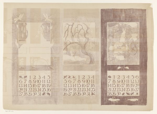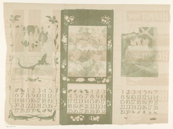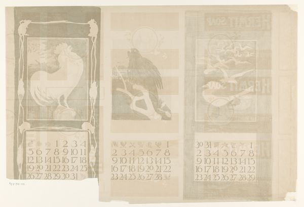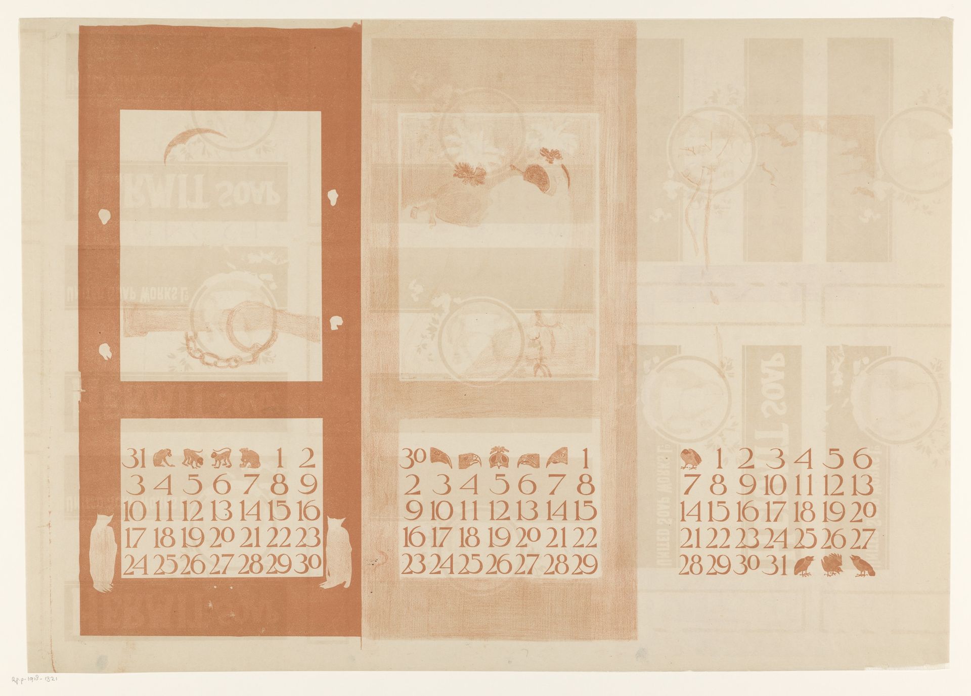
1901
Kalenderbladen van januari, februari en maart, met vogels
Theo van Hoytema
1863 - 1917Location
RijksmuseumListen to curator's interpretation
Curatorial notes
Editor: Here we have Theo van Hoytema’s 1901 print, "Kalenderbladen van januari, februari en maart, met vogels" from the Rijksmuseum. It is gentle in color and composition. It looks like each month’s calendar is adorned with subtle vignettes, a minimalist approach to functional design. What strikes you when you look at this, from a formal perspective? Curator: The arrangement certainly catches the eye, doesn't it? We see a tripartite structure, where each section—ostensibly January, February, and March—exists almost as an independent canvas, unified, however, through a restricted palette. Editor: Restricted how? Curator: Note the dominance of a singular hue, a sort of sepia, or perhaps a muted sienna, applied throughout. This deliberate choice in tonality guides our gaze. Moreover, consider the deliberate placement of these ornithological forms – the birds. Are they simply decorative? Or do they serve to break up the geometry of the calendars themselves? What is their relationship to the grid-like structure inherent in a calendar layout? Editor: I suppose they could be both! They’re decorative, but they also cleverly interrupt what could be an overly rigid design. I’m starting to see how Hoytema balances utility with artistry. Curator: Precisely. And it is in this tension, this delicate interplay between form and function, that the essence of the work resides. By stripping away superfluous details, focusing solely on the inherent structure and materiality, we reveal the foundational principles upon which this print, and indeed, art itself, is built. Does examining it through this lens shift your perspective at all? Editor: It does! Before, I saw just a calendar, now, I'm aware of Hoytema's structural considerations, his deliberate colour choices and careful balancing act. It really shows how much we can appreciate just by observing composition and form.