Copyright: CC0 1.0
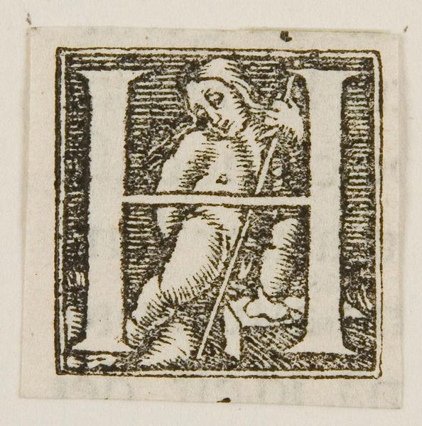
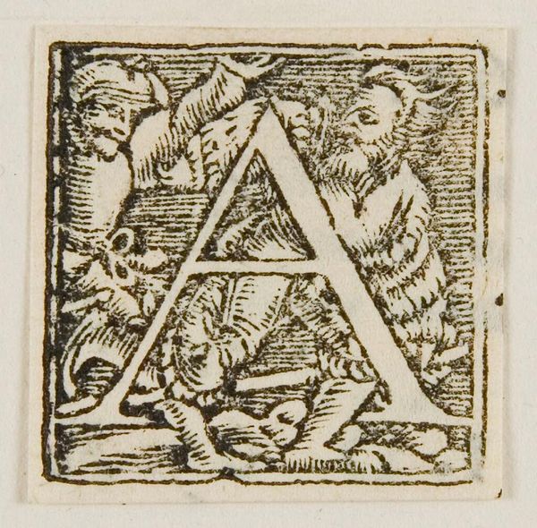
Editor: Here we have "Initial H" by Hans Holbein the Younger. It's a captivating image, but the stark contrast between the letter and the figures almost feels confrontational. What do you make of the composition? Curator: Observe how the rigidity of the letterform provides a structural counterpoint to the organic, almost chaotic, arrangement of the figures. Note the artist’s control of line and texture, creating depth within such a small field. Does this not evoke a sense of contained energy? Editor: It does, actually, now that I think about it! So the tension contributes to the overall impact of the work? Curator: Precisely. By examining the formal elements, we can understand how Holbein creates a dynamic relationship between form and content. Editor: Thanks, I see this piece very differently now.
Comments
No comments
Be the first to comment and join the conversation on the ultimate creative platform.
More like this