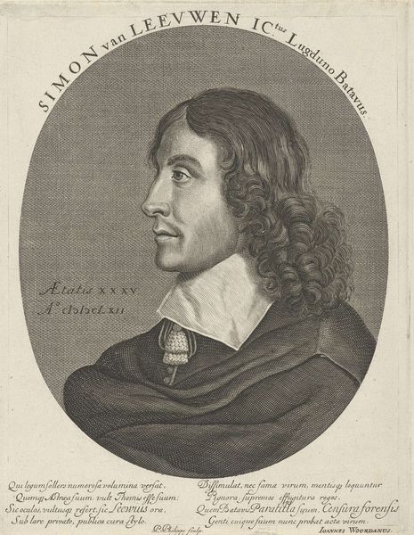
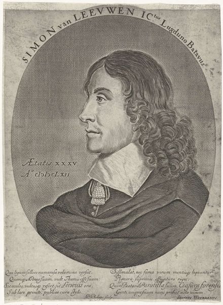
engraving
portrait
baroque
old engraving style
figuration
historical photography
line
history-painting
engraving
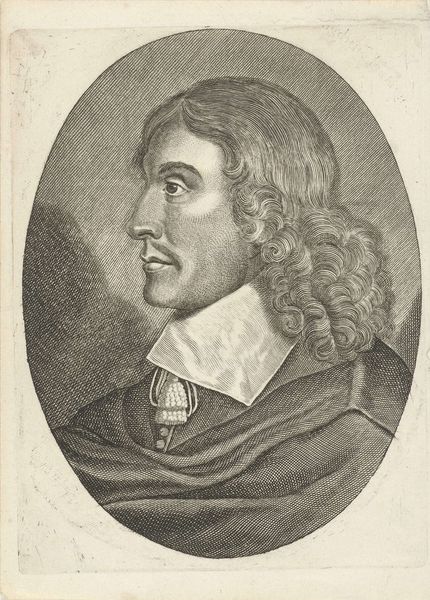
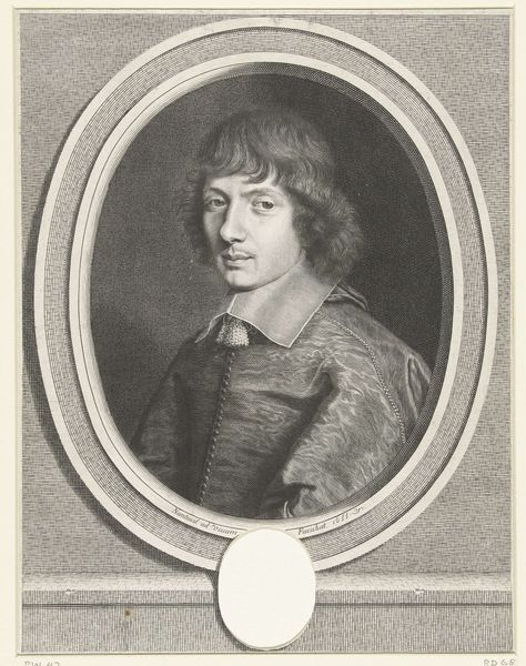
Dimensions: height 309 mm, width 195 mm
Copyright: Rijks Museum: Open Domain
Editor: Here we have Jeremias Falck’s 1644 engraving, "Portret van Copernicus". The detail achieved through line work is incredible, and I’m struck by how modern it feels, even though it's centuries old. How would you interpret this piece, looking at the formal elements? Curator: Observe how Falck constructs the image primarily through contrasts – the tight curls of Copernicus' hair against the smooth planes of his face. The sharp, clean lines used for the lettering further contrast the softer, more diffuse etching in the portrait itself. Editor: Yes, the texture is quite interesting! So, are you suggesting the form highlights certain aspects of the subject? Curator: Precisely. Consider the oval frame. Its curvature gently emphasizes Copernicus' face, focusing the gaze. The lines converge towards his features, underscoring the intellectual intensity he likely possessed. Moreover, the relatively shallow depth of field throws the background into a subtle blur. Editor: Is it correct to state that it adds depth? I was too focused on lines, I did not register the use of space as intentional depth and focus. Curator: Indeed! What might this layering and focus suggest to you? Is it mere adornment or is there another level of intentional design at play, framing our perception of Copernicus in a certain light? Editor: Well, maybe that Falck isn't just trying to replicate reality, but interpret Copernicus' legacy using techniques available in Baroque printmaking. Curator: Excellent point. Understanding these nuances helps unlock layers of meaning within the work. Thank you, your keen observations have offered a new lens on it.
Comments
No comments
Be the first to comment and join the conversation on the ultimate creative platform.