#
aged paper
#
homemade paper
#
paperlike
#
sketch book
#
personal journal design
#
paper texture
#
personal sketchbook
#
paper medium
#
design on paper
#
historical font
Dimensions: height 167 mm, width 230 mm
Copyright: Rijks Museum: Open Domain
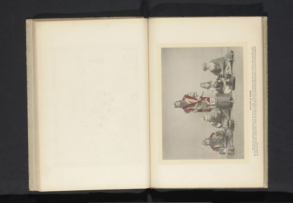
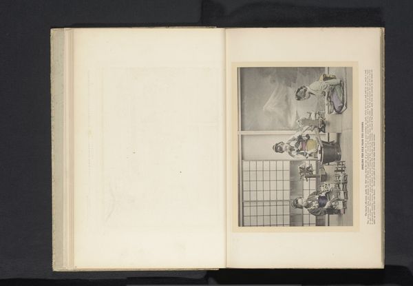
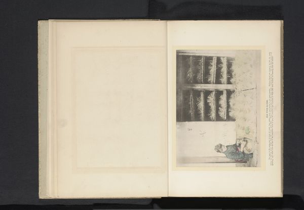
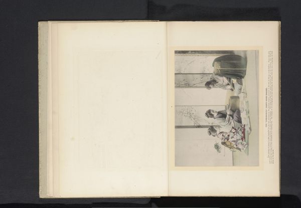
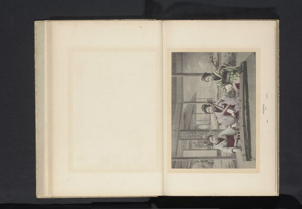
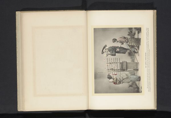
Curator: Here we have an intriguing page from what appears to be an antique scrapbook, showcasing an image titled "Drie vrouwen spelen het spel Go," placing it sometime before 1900. What’s your immediate take? Editor: The visual simplicity is compelling. The muted colors, combined with what looks like an aged paper, create a distinct aesthetic harmony and enhance the quiet atmosphere of the depicted scene. It has a fragile but precious quality to it. Curator: Note how the entire presentation—the paper stock, possibly homemade, its yellowed quality and texture—become integral to our experience. These aren't neutral elements; they reflect the limited industrial processes available and perhaps a personal, sentimental value placed upon documenting social customs like game playing in private settings. Editor: True, but beyond this contextual background, it's also fascinating how the composition invites us to see relationships and patterns between shapes. The game Go, with its interplay of black and white stones, serves as a microcosm mirroring broader symbolic contrasts. Notice how it all emphasizes form in the representation. Curator: Agreed, yet isn't that game also representing something beyond color? The production of this material - homemade paper - to register what are likely class dynamics. It all circles back to economic forces indirectly shaping what stories get recorded this way in a book of remembrance. Editor: All of which undeniably enhances how the artist uses contrast in both color and content! Whether consciously, they harness inherent drama for powerful effect with line, light, form… The visual rhythm really locks everything into place compositionally. Curator: Precisely; and acknowledging those power structures informs the visual construction itself! How notions about class get materialized through a seemingly objective artistic choice. This piece encourages critical awareness about consumption! Editor: An interpretation as multi-layered as its texture. Now looking once again with both aesthetic interest and socio-economic mindfulness certainly enriches appreciation. Curator: Indeed, seeing materiality merge gracefully with conceptual weight is quite stimulating.
Comments
No comments
Be the first to comment and join the conversation on the ultimate creative platform.
More like this