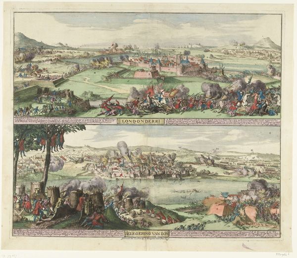
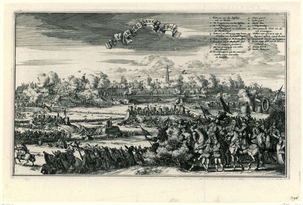
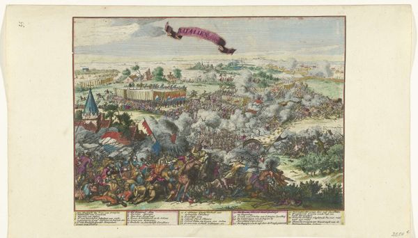
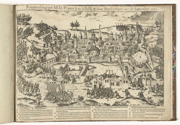
Belegering en verovering van Naarden door de prins van Oranje, 1673 1673
0:00
0:00
romeyndehooghe
Rijksmuseum
print, engraving
#
water colours
#
baroque
# print
#
landscape
#
coloured pencil
#
genre-painting
#
history-painting
#
engraving
#
watercolor
Dimensions: height 416 mm, width 537 mm
Copyright: Rijks Museum: Open Domain
Curator: This vividly coloured engraving captures the “Siege and Capture of Naarden by the Prince of Orange, 1673,” created that very year by Romeyn de Hooghe. What's your initial take on it? Editor: It's chaotic, isn't it? Like a battlefield diorama exploded onto a page. So much detail crammed into every corner—from the grand battle to what seem like quiet, human dramas happening amidst it all. Curator: Absolutely, that layering effect is quite intentional, creating a feeling of immersive simultaneity. De Hooghe was known for his allegorical and historical prints, and here, the map nestled at the top almost anchors the 'truth' of the event. You’ve got history rendered as both panorama and intimate drama. Editor: The map! Clever. A reminder of the stakes, maybe? Because without it, the image runs the risk of getting lost in all the activity and the busyness of color, if that makes sense. Still, even without the guide of that map, there’s just an overwhelming sense of ambition here, artistically. Curator: That ambition resonates with the Baroque style that infuses the artwork; there's this drive to encompass the enormity of the event within a single, powerful frame. Think about all those symbolic elements, too - flags, weaponry, gestures of surrender or defiance. All contribute to its grand, propagandistic message. Editor: Propagandistic… of course. Beyond the battlefield, I keep noticing those smaller figures in the foreground. What feels almost like genre-painting details: vignettes of suffering, resistance, and the cost of conflict. The figures in the tents and trenches in the foreground have very compelling personal expressions too. Curator: They serve to ground the glorious history with grim reality, amplifying the human dimension. What do you make of the color palette, so striking for an image depicting something so… intense? Editor: Perhaps it softens the blow, aesthetically speaking? I'm not sure it succeeds completely. There's something almost naive in the way such dramatic themes and battles can be reduced to this colorful tableau, especially when looking at this centuries later. The symbols risk being obscured by the sweetness of the watercolors, ironically enough. Curator: I can see that point, a kind of sugar-coating on a rather brutal truth, which could have been De Hooghe's objective at that point: A Baroque spin, after all. Editor: Definitely a thought provoking artifact to examine and ruminate over! Curator: Agreed, it's a complex tapestry of war, artistry, and propaganda, that continues to spark meaningful conversations.
Comments
No comments
Be the first to comment and join the conversation on the ultimate creative platform.
More like this