Curatorial notes
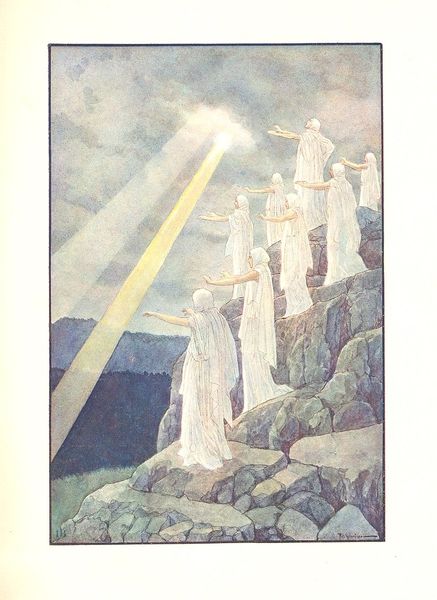
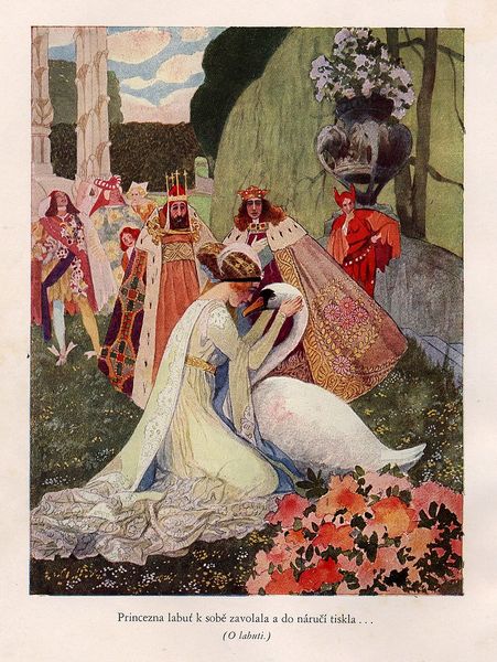
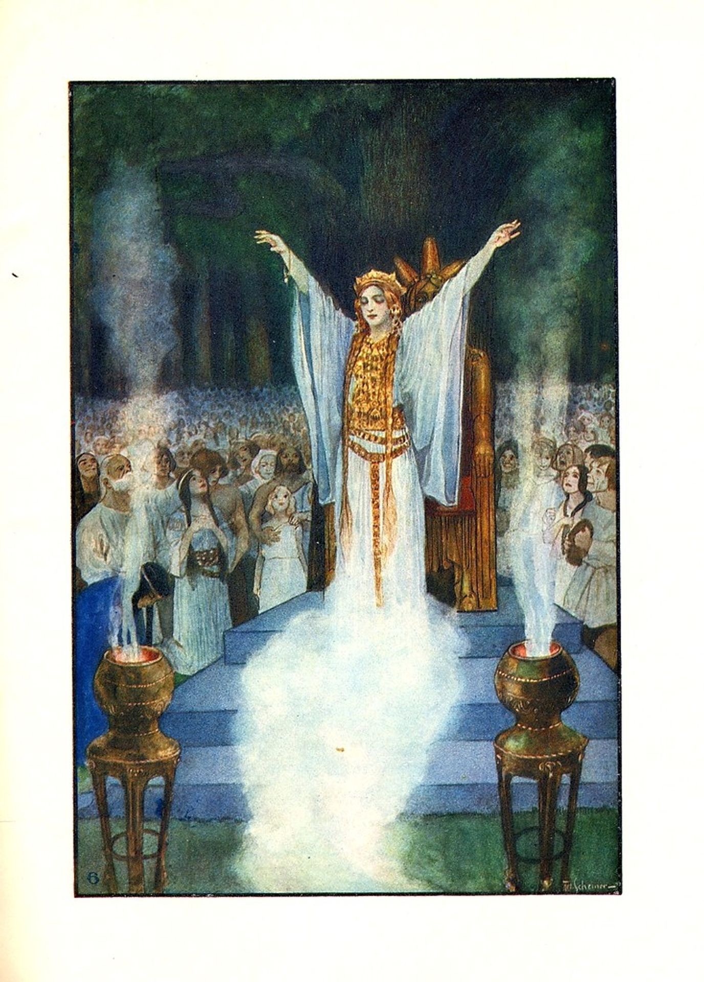
Editor: So this is Artuš Scheiner's "Illustration for Vyšehrad," a watercolour painting. The wispy washes create an ethereal mood, almost as if we're looking at a memory. What catches your eye about its formal qualities? Curator: Initially, the strategic deployment of light. Observe the concentration of white around the central figure and rising towards the implied source of illumination above. This gradient immediately establishes a visual hierarchy. Editor: It really does guide your eye right to her. Curator: Precisely. Notice, too, how the figures surrounding her are pushed into relative darkness, simplifying their forms. The artist minimizes detail to amplify the central subject’s visual prominence. Do you find this contrast effective? Editor: Definitely. The hazy treatment of the crowd isolates the regal figure even further. The use of colour reinforces this, too. There is very little vibrancy aside from the yellows. Curator: Precisely. Note the symbolic and structural function of the implied golden hues. They operate within a system of visual cues intended to convey themes of authority and divinity. The palette and rendering technique collaborate to achieve an effect, not of literal depiction, but evocative symbolism. Editor: That makes so much sense. Seeing how the composition and colors all build towards highlighting that figure opens up so many ways of understanding this illustration. Curator: Yes, an approach through form provides an insightful access point into the work.