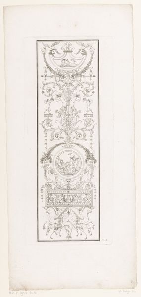
Indramning med medallionen af Chr. I, Fr. 3. og Fr. 7. 1825 - 1893
0:00
0:00
drawing, print, ink, woodcut, engraving
#
portrait
#
drawing
#
ink painting
# print
#
figuration
#
ink
#
woodcut
#
line
#
genre-painting
#
history-painting
#
academic-art
#
engraving
Dimensions: 163 mm (height) x 100 mm (width) (bladmaal)
Curator: It has a sepia tint like an antique photograph that gives off this slightly haunted vibe like a portrait in a gothic novel. Editor: Right. Well, this is "Indramning med medallionen af Chr. I, Fr. 3. og Fr. 7." roughly translated to 'Framing with medallions of Christian I, Frederick III, and Frederick VII’ Created between 1825 and 1893, its a print crafted with engraving, etching, and woodcut techniques, now housed at the SMK, the National Gallery of Denmark. The artist? Balzer Dahl. Curator: Those austere faces peering out, all those dense lines in the ornamental borders, give it such weight and seriousness. A far cry from a lighthearted commemoration. Almost… oppressive? Editor: I think that's quite perceptive. Dahl was active during a period of significant political and social change in Denmark, particularly regarding national identity. Remember, absolutism ended in 1848 and the first truly free election occurred the year after, with the first constitutional revision coming in 1866. Medallions of past leaders like this sought to create visual continuity during a chaotic time in parliamentary transformation. It aimed to anchor the present in a selectively imagined past. Curator: It sounds like political marketing hiding under the guise of remembrance. What does the technique accomplish here? Is it celebrating those achievements or manipulating public sentiment through imagery? I can't decide. Editor: I think it's fair to argue for the second: Dahl made skillful choices combining older graphic techniques with more modern industrial techniques. All the graphic weight of engraving and etching, mixed with faster and larger-scale reproduction of the woodcut. Making images ubiquitous and accessible became its own kind of power. Curator: Making accessible, though... still such grim faces staring you down... What about the flags, or the heavy ornamental flourishes? Did they make the imagery too on-the-nose and too literal, losing that visual depth along the way? Editor: I think that directness was probably intentional. We tend to project 21st-century subtlety onto 19th-century audiences who were much more willing to interpret symbols at face value. So perhaps those stiff flags, stiff portraits, were supposed to convey resolve at a moment of transition. Curator: Transition or attempted cultural hegemony, perhaps both at the same time. Thanks, it will definitely impact the way I consider that image from now. Editor: It feels like the dialogue brings fresh perspectives into light, enhancing its inherent charm, after all.
Comments
No comments
Be the first to comment and join the conversation on the ultimate creative platform.
More like this