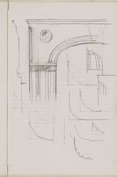
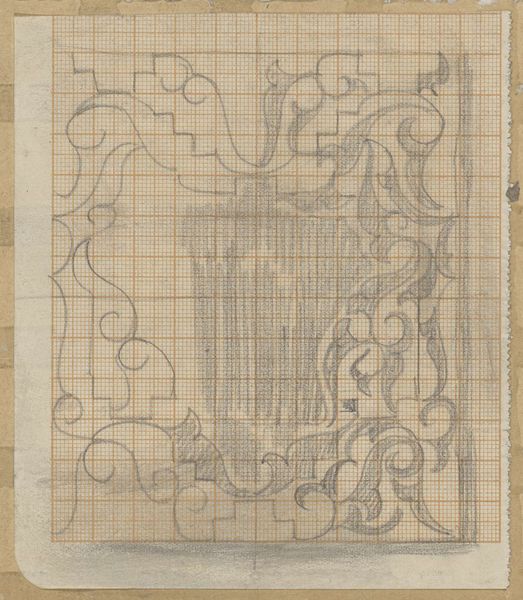
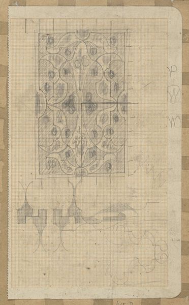
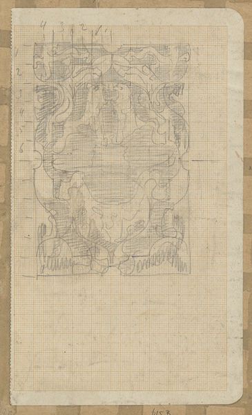
drawing, paper, pencil
#
drawing
#
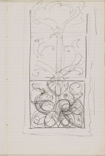
art-nouveau
#
paper
#
form
#
geometric
#
pencil
#
line
Copyright: Rijks Museum: Open Domain
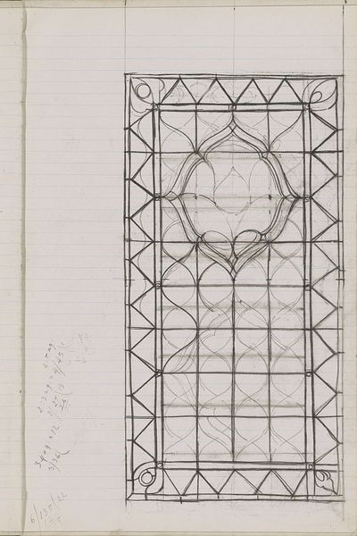
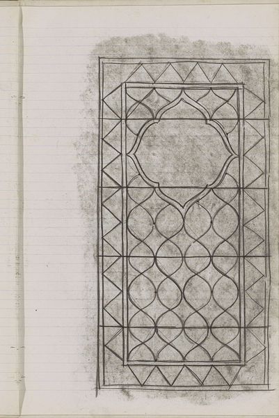
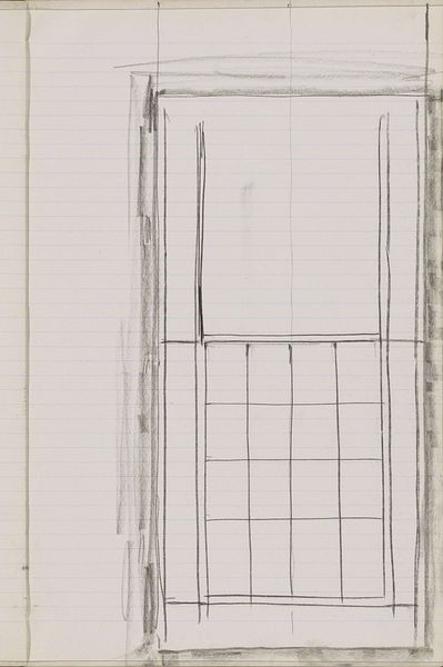
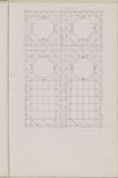
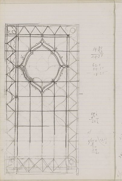
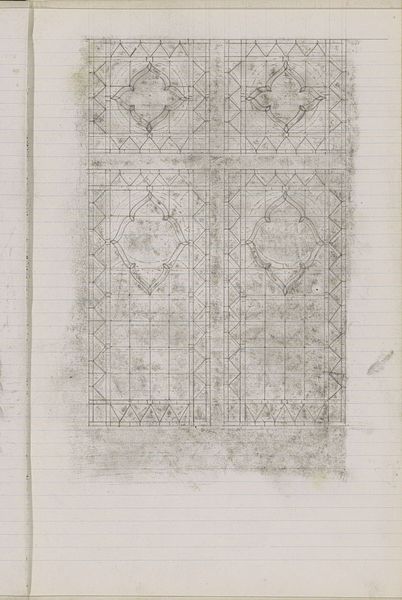
Curator: Welcome. Today we’ll be examining Gerrit Willem Dijsselhof's "Ontwerp voor een glas-in-loodvenster," or "Design for a Stained-Glass Window," created circa 1901. It’s currently held here at the Rijksmuseum. Editor: My first impression is of constraint. The lines are deliberate, contained. There's a quietness about it, even in its incomplete state. It almost feels like a meditation on structure. Curator: Indeed. What stands out to me is Dijsselhof's emphasis on pure form. Notice the geometric grid, the way the pencil lines create a sense of both order and understated elegance typical of the Art Nouveau movement. The integration of geometric shapes like triangles, squares, and that striking central circle commands the eye. Editor: But is it truly just form we're observing, or does the planned use of stained glass and its intended architectural context, begin to weave a richer, even social narrative? Stained glass, traditionally, serves not only aesthetic, but also narrative purposes. Churches and affluent homes of this era sought to illustrate cultural values of the time via a specific symbolism. Curator: I concede the eventual use informs the work. However, even here, in this preliminary sketch, one is struck by the stark absence of overt symbolism, especially nature. Dijsselhof instead emphasizes formal arrangements and the rhythmic interplay of line. He creates an interplay between vertical and horizontal elements; he's less concerned with narrative. Editor: But Dijsselhof lived and worked in a rapidly changing sociopolitical climate in the Netherlands. Doesn't it seem likely that even this deliberate eschewing of overt symbolism reflects his stance in this changing society? Perhaps the deliberate return to foundational geometric forms serves as commentary on order. The emphasis is more personal, almost interior. What about considering potential spiritual leanings in Art Nouveau? Curator: Interesting. Though that seems speculative, Dijsselhof may also seek to challenge conventional understanding, favoring clarity in a society gripped by uncertainty. I still consider the design’s appeal more enduring than timely: beyond a specific moment, more attuned to an abiding understanding and appreciation of beauty as it is formally conceived. Editor: Perhaps that interplay is the power of the work—that delicate balance between enduring form and an implied sociohistorical stance. This simple sketch presents a silent dialogue between what persists and what shapes us. Curator: A very astute thought that makes one want to keep pondering the purpose behind Dijsselhof’s composition, especially concerning his placement and spatial intention, that the eye sees right before the glass, light, and colour are applied. Editor: Yes, revealing its function: to mediate. What will pass through it is just as vital as its rigid formal structure.
Comments
No comments
Be the first to comment and join the conversation on the ultimate creative platform.
More like this