print, photography, gelatin-silver-print
# print
#
book
#
landscape
#
photography
#
gelatin-silver-print
Dimensions: height 144 mm, width 225 mm
Copyright: Rijks Museum: Open Domain
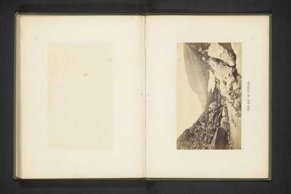
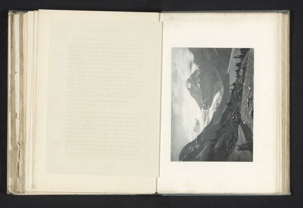
Editor: Here we have "Twee afbeeldingen van een gems in de sneeuw," or "Two Images of a Chamois in the Snow," created before 1898, probably a gelatin-silver print. It's a book illustration of a landscape... monochromatic, of course. The composition seems split—the top and bottom images have a different point of view. How do you read the relationship between these two images? Curator: The critical dialogue begins not with external narratives, but with the internal structure of the work itself. Note how the opposing viewpoints creates tension in what would be an ordinary mountainscape. Observe how tonality and value function in concert: the darkest accents existing only near the implied foreground; it creates recession by drawing the eye in steps, but keeps it always locked inside the frame. Note how the artist manipulates texture and sharpness to create a stark visual landscape, devoid of sentimentality. Editor: So, it’s the construction of space, rather than the subject, that defines its power. What about the lack of color? Is that purely a function of the date of the print? Curator: Consider how its grayscale image lends to the work a sense of timelessness and austere beauty. The reduced palette draws all the more attention to the tonal nuances that create depth, and allows us to concentrate on compositional elements in pure form. Color would potentially distract us from understanding the underlying structural aspects of its design. Editor: I never would have considered the date as an aesthetic *choice*! It feels less documentary now. Curator: Yes, by consciously isolating the aesthetic elements, a greater appreciation of the artist's technical skill becomes visible. Now, consider what other dimensions we might have previously overlooked!
Comments
No comments
Be the first to comment and join the conversation on the ultimate creative platform.
More like this