drawing, print, paper, ink
drawing
pen sketch
paper
ink
calligraphy
Copyright: Rijks Museum: Open Domain
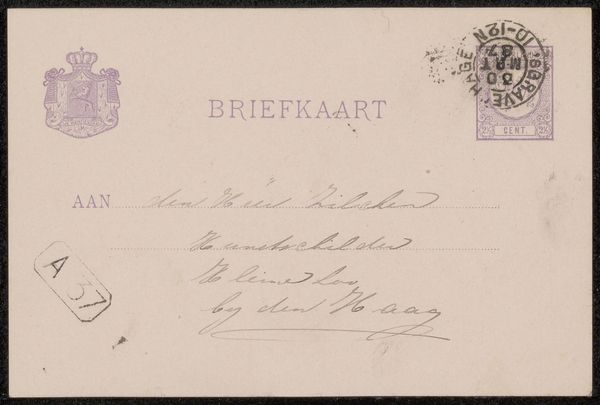
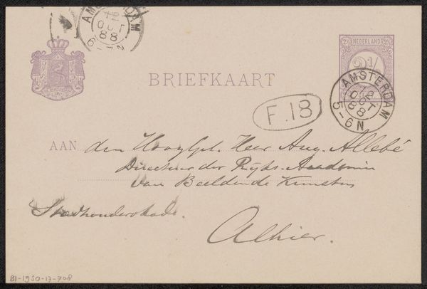
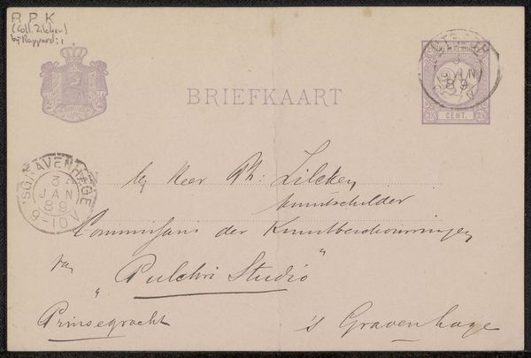
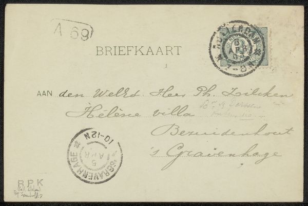
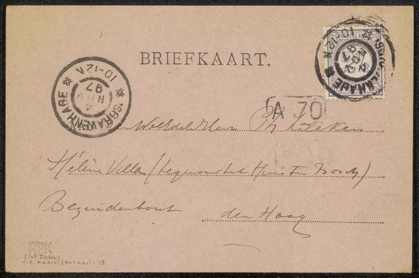
This is a piece by Arnold Koning, it’s a briefkaart, or postcard, addressed to Pieter Anne Haaxman. You know, sometimes the simplest things can be the most interesting, like the way the writing seems to float on the surface of the card, or the stamp sitting there with its little cancellation mark. The surface has this beautiful, aged quality, a kind of off-white that makes the ink stand out. It’s like the whole thing is breathing, isn’t it? Look at the writing, it’s so delicate, like a spider’s web. I wonder what he was trying to convey? Was it urgent, or just a friendly hello? I like the way he underlines The Hague, a simple detail that adds a bit of emphasis. It reminds me a bit of some of Cy Twombly’s work. There’s something about the handwritten text, the way it dances across the surface, that feels so immediate and personal. For me it’s a gentle reminder that art doesn’t always have to be loud or flashy. Sometimes, it’s the quiet, intimate gestures that speak the loudest.
Comments
No comments
Be the first to comment and join the conversation on the ultimate creative platform.