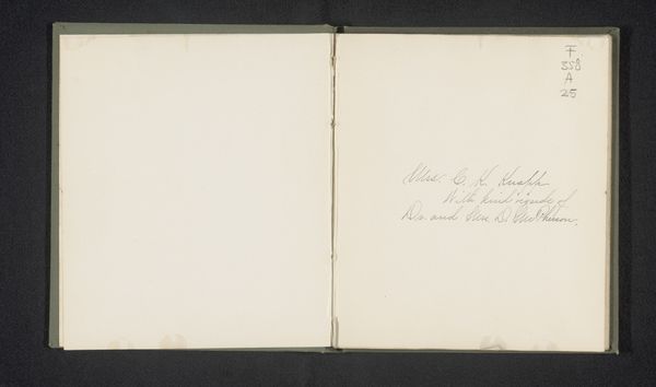
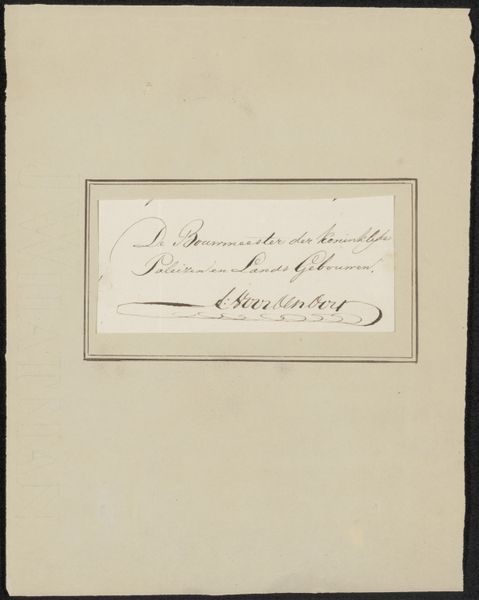
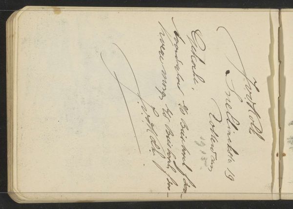
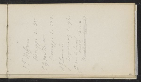
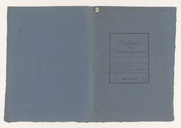
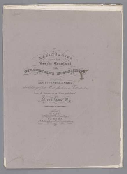
Erection à Gap de la statue de M. le Baron de Ladoucette ancient préfet dess Hautes-Alpes sous le premier Empire 1866
0:00
0:00
drawing, paper
#
drawing
#
aged paper
#
homemade paper
#
sketch book
#
hand drawn type
#
paper
#
personal sketchbook
#
hand-drawn typeface
#
fading type
#
thick font
#
sketchbook drawing
#
history-painting
#
academic-art
#
sketchbook art
#
calligraphy
Dimensions: height 277 mm, width 225 mm, thickness 14 mm
Copyright: Rijks Museum: Open Domain
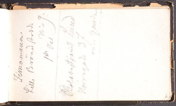
Editor: This drawing, dating back to 1866, is by Louis-Xiste Delaplace. It’s titled "Erection à Gap de la statue de M. le Baron de Ladoucette ancien préfet des Hautes-Alpes sous le premier Empire"— quite a mouthful! It seems to be a page from a sketchbook, detailing the plans for a statue. The aged paper gives it a very antique feel. What story do you think this piece is trying to tell? Curator: A sketchbook page... a raw glimpse into history, wouldn't you agree? It's more than just planning a statue; it’s about immortalizing a person and a specific political power structure, even, perhaps, an effort to write—or rewrite—history. The somewhat hasty sketches and the varied, almost eccentric typography suggest a personal involvement, an artist deeply connected to the subject, perhaps even politically sympathetic to the Baron. Notice the delicate cursive script layered on top of the bold, almost shouting, printed text; how would you say the piece's affect shifts between these distinct forms? Editor: I hadn't considered the shift between script and typeface... almost like a contrast between official business and personal sentiment? Curator: Exactly. And that’s the wonderful tension this seemingly simple sketchbook page creates! The monument, the Baron's legacy, juxtaposed against the ephemeral nature of the sketch, a fleeting moment in time. It hints at the grandiosity of power but reminds us of the humble human hand that strives to maintain it. What I find touching, ultimately, is the slightly disorganized nature of the typography... perhaps the artist was working without models or pre-planned materials? It all feels rather earnest! Editor: That's a great perspective. Seeing it as this push-and-pull of political force against more fragile, sentimental impulses. Thanks so much. Curator: It's a conversation starter, isn’t it? Each line a whisper from the past. And really, isn't all art about trying to find those echoes, or, maybe, to invent new ones for the future?
Comments
No comments
Be the first to comment and join the conversation on the ultimate creative platform.
More like this