silkscreen, mixed-media, print, acrylic-paint, photography
#
silkscreen
#
mixed-media
#
contemporary
# print
#
appropriation
#
pop art
#
acrylic-paint
#
figuration
#
social-realism
#
photography
#
acrylic on canvas
#
pop-art
#
history-painting
Copyright: Modern Artists: Artvee
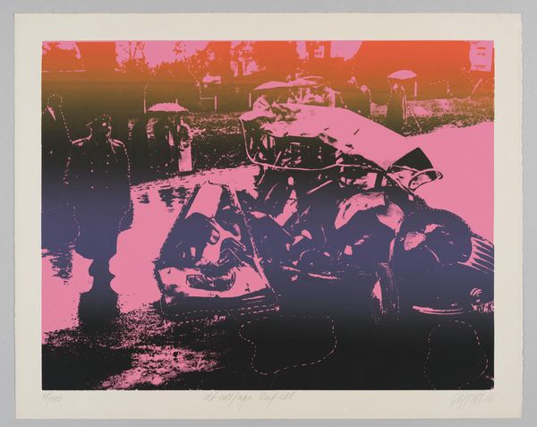
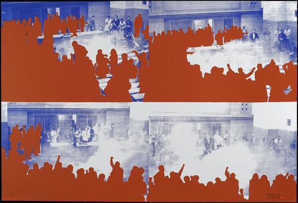
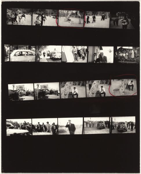
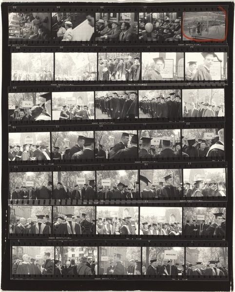
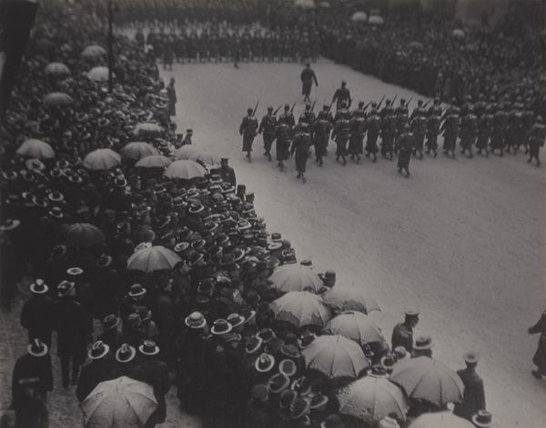
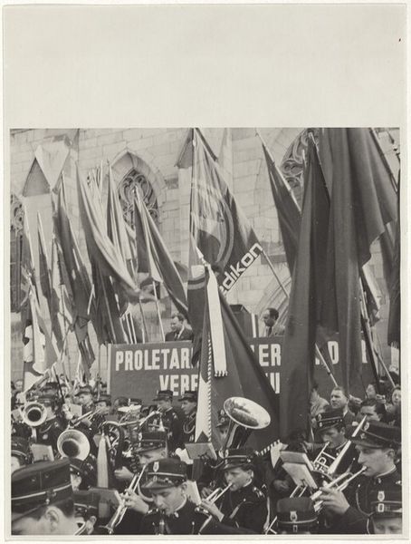
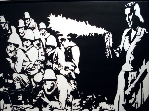
Andy Warhol made this "Race Riot" sometime during the 1960s. It's printed in a grid format, with blocks of different colours that feel very immediate because of the way he approaches the silkscreen. The silkscreened image is impactful, with the flat blocks of strong colors, like that searing red, creating something that vibrates right off the surface. You can almost feel the heat and the violence. It’s raw and it’s meant to be. Look at the edges of the figures, how they bleed into the background and aren’t super clean. The roughness in the image amplifies the subject matter of the piece. There's a push and pull between the medium and the message. Like a lot of Warhol's work, the colours also flatten the image into something that becomes iconic, more like a logo than a historical document. Think about how Robert Rauschenberg used silkscreening, too. There’s an ongoing conversation here about how we see and remember. It isn’t so much about answers, but about constantly asking questions.
Comments
No comments
Be the first to comment and join the conversation on the ultimate creative platform.
More like this