drawing, paper, ink
#
portrait
#
drawing
#
baroque
#
paper
#
ink
#
watercolor
Copyright: Rijks Museum: Open Domain
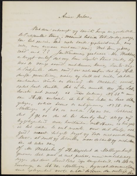
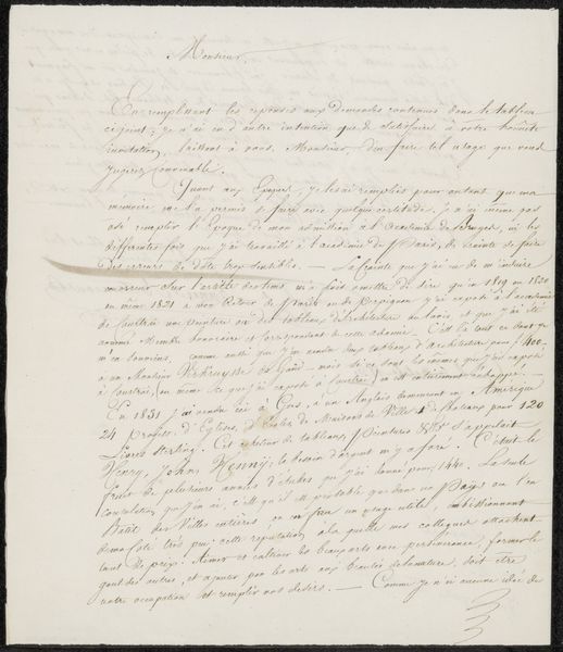
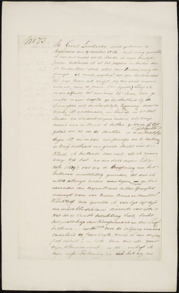
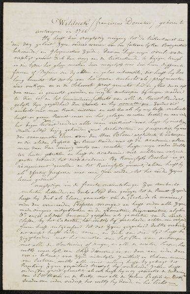
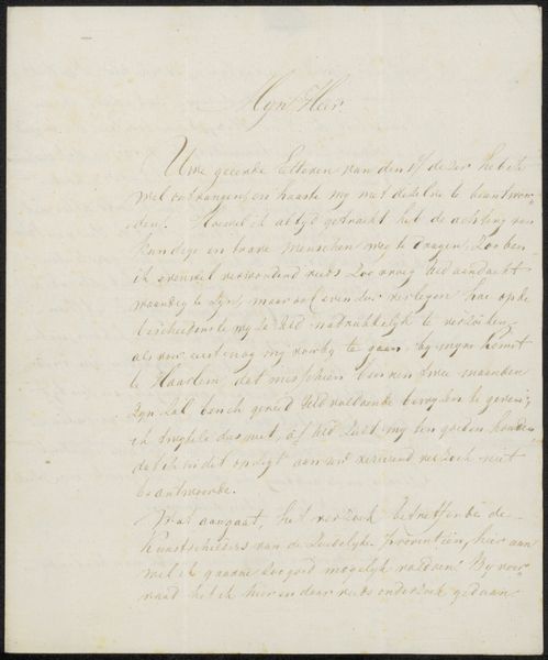
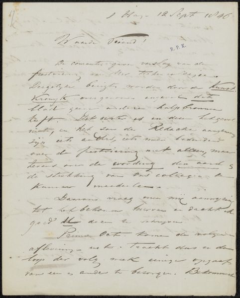
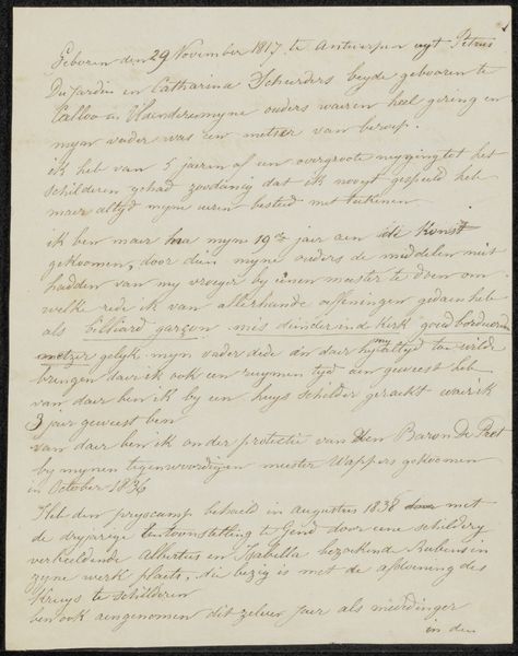
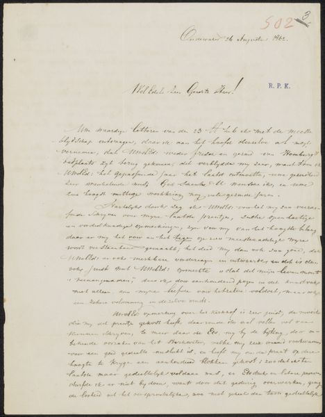
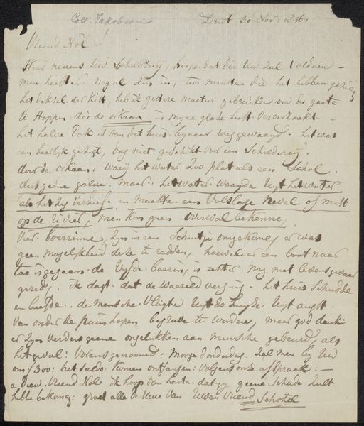
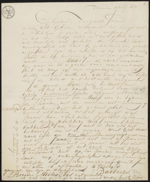
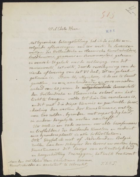
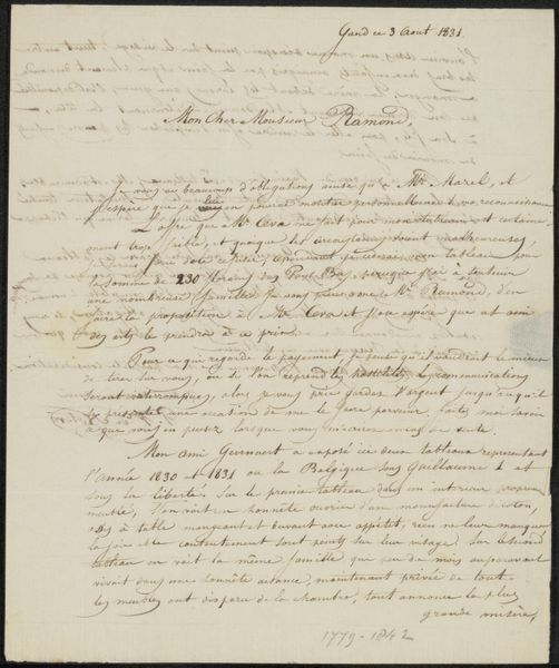
Curator: This brittle, slightly off-white document titled "Brief aan Jan van Musschenbroek" by Martin Holtzhey, potentially from 1738, gives off an immediate feeling of aged fragility. It's crafted from ink on paper, employing watercolor, a rather intimate medium choice. What is your initial response to the drawing, before diving into its history? Editor: It strikes me as visually busy; the density of the handwriting, combined with what appears to be some bleeding of the ink, makes it hard to find a focal point. What compositional strategies are at play here? Curator: The composition lacks a deliberate focal point in the conventional sense, prioritizing the linear cadence of the text. This piece operates more as a field of information, prioritizing communication over purely aesthetic concerns. Note how the even distribution of ink and the consistent stroke width of the handwriting create a unified surface. The form embodies the content. Editor: So, the act of writing is elevated here, not just the information being conveyed. Curator: Precisely! We must ask, "How does this presentation influence the viewer's perception of its message and overall aesthetic impact?" Note, too, the almost complete absence of pictorial elements, the focus solely on text elevates its significance. The materiality of the ink on paper, the very act of inscription, become central to its artistic merit. Do you perceive a potential philosophical link between content and presentation? Editor: I see that now. The deliberate, uniform presentation reinforces the sincerity of its message. Are there are broader art historical movements we can use to categorize this style? Curator: While the drawing shares some visual characteristics with Baroque art through its dynamic and ornate character, its unique emphasis on text deviates significantly, almost standing in stark contrast to its more widely-known contemporaries. By challenging conventional pictorial composition, Holtzhey offers a subtly subversive and fascinating reinterpretation of existing techniques. It showcases Baroque aesthetic's more functional side. Editor: I hadn’t considered that such close consideration to lettering would create such impact. I am also curious about this subversive approach. Curator: Recognizing this tension reveals more nuances in your analysis. Keep this in mind for our future discussions.
Comments
No comments
Be the first to comment and join the conversation on the ultimate creative platform.
More like this