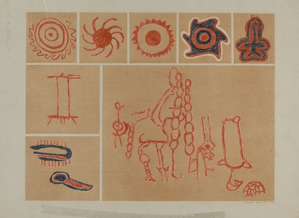
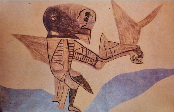
![Inside Front Cover [ Left ] by Karl Bodmer](/_next/image?url=https%3A%2F%2Fd2w8kbdekdi1gv.cloudfront.net%2FeyJidWNrZXQiOiAiYXJ0ZXJhLWltYWdlcy1idWNrZXQiLCAia2V5IjogImFydHdvcmtzLzk3MjViYzNkLWE5M2ItNGY3ZS1hYzk2LTg3M2ZhZjI0NmM1MC85NzI1YmMzZC1hOTNiLTRmN2UtYWM5Ni04NzNmYWYyNDZjNTBfZnVsbC5qcGciLCAiZWRpdHMiOiB7InJlc2l6ZSI6IHsid2lkdGgiOiAxOTIwLCAiaGVpZ2h0IjogMTkyMCwgImZpdCI6ICJpbnNpZGUifX19&w=1200&q=75)
paper
#
paper
#
coloured pencil
#
watercolour bleed
#
watercolour illustration
#
mixed media
#
watercolor
#
indigenous-americas
Copyright: Public domain
Editor: This is "Inside Front Cover [ Left ]" by Karl Bodmer. It seems to be a mixed-media work that includes watercolor, and it looks like the illustration features objects associated with Indigenous American cultures. What can you tell us about how the artist uses form and composition here? Curator: Observe how Bodmer arranges these objects. Note the visual balance, achieved without strict symmetry. Consider the varying textures – the soft fur, the smooth pipe, the rough hide – and how watercolor and coloured pencil lend themselves to rendering these different tactile qualities. How do these variations affect your experience of the piece? Editor: The textures really do stand out! I also notice how each object is depicted with precise detail, like individual portraits. It makes me wonder about the meaning of this particular composition; do you think it’s just decorative? Curator: The “meaning” is in the viewing and deconstruction of elements such as tone and contour and, as you suggest, texture. Is there a relationship between the object's visual qualities and its placement or relation to other objects? Can that analysis contribute to the “meaning” of this arrangement? Editor: I see what you mean! Thinking about it formally like that gives me a whole new way of looking at it, and making connections I hadn't considered before. Curator: Exactly. By carefully examining the relationships of visual forms within the work, we can go beyond simple description and open possibilities about how such works engage viewers.
Comments
No comments
Be the first to comment and join the conversation on the ultimate creative platform.
More like this