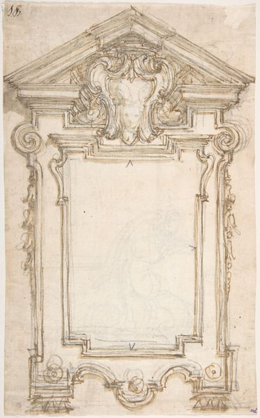
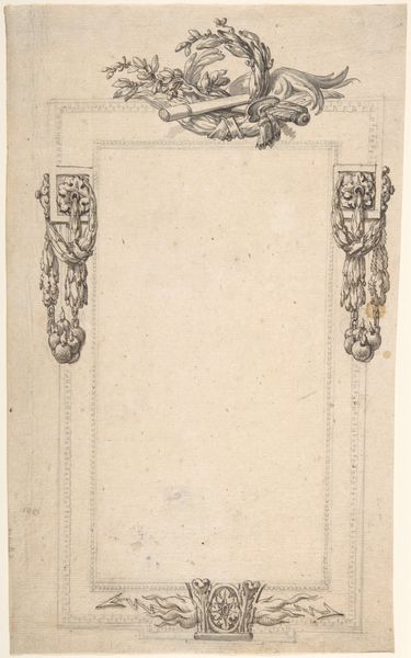
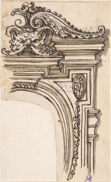
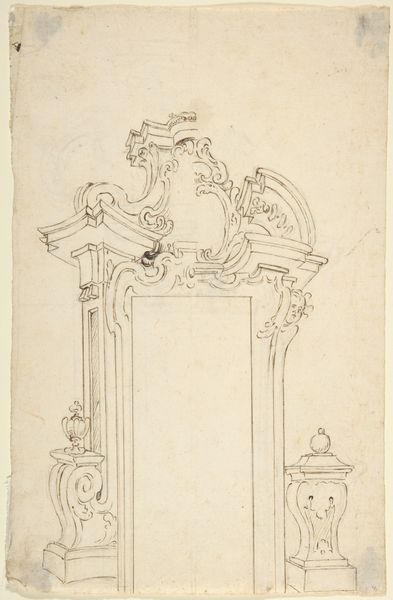
Design for a Frame Decorated with a Shell Motif 1652 - 1725
drawing, ornament, paper, pencil
drawing
ornament
baroque
paper
pencil
Dimensions: sheet: 4 x 2 11/16 in. (10.2 x 6.8 cm)
Copyright: Public Domain
Editor: This is Giovanni Battista Foggini’s "Design for a Frame Decorated with a Shell Motif," dating roughly from 1652 to 1725. It’s a pencil drawing on paper, currently held at The Met. It's sparse, but still so ornate. What compositional elements strike you the most? Curator: The dominance of line is quite compelling. Notice how Foggini uses variations in the weight and density of the pencil strokes to define form and suggest depth, particularly in the shell motif. The absence of shading, beyond the linear hatching, draws our attention to the pure structure of the design. How does the interplay of geometric and organic shapes contribute to your reading of the design? Editor: I see the clear rectangle of the frame as quite geometric, especially against the free-flowing curls above and below, which makes me focus more on the details, almost like separate components versus an integrated design. Curator: Precisely. The Baroque aesthetic often employs such tensions. Consider the spiraling lines, the delicate volutes – how do these linear elements contribute to a sense of movement and dynamism within the otherwise static form of a frame? Are there particular relationships between forms that indicate hierarchy or importance within the design? Editor: It definitely pushes the eye upward with the strongest lines in the shell drawing the eye to the top, but that also has me noticing the empty frame shape even more. Curator: Indeed. The blank space is not merely an absence but a crucial element. It invites speculation. Does it create tension with the intricate surround, or offer a moment of visual rest? The shell is balanced atop very simple architectural shapes. Its curvaceous forms seem to contrast to the right angles that predominate, setting up what? Editor: A play between nature and structure? I guess I hadn’t considered the relationship between them before. Curator: I concur. By focusing on these formal relationships and tensions, we gain insights into Foggini’s design sensibilities, his awareness of balance, and the symbolic potential within pure form. Editor: Thanks. It’s amazing how much one can gather just by considering the pure composition.
Comments
No comments
Be the first to comment and join the conversation on the ultimate creative platform.