Copyright: Modern Artists: Artvee
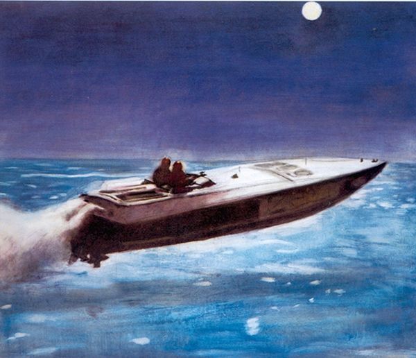
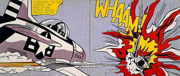
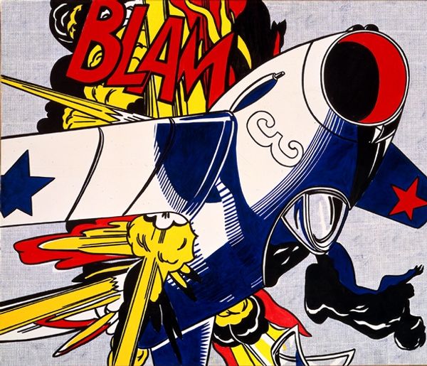
Andy Warhol made this “Police Car” sometime in his career using screenprinting techniques. The image has a real flatness, which is ironic, because it's an image of a car, a symbol of motion. But Warhol seems to have sucked all the depth right out of it, hasn't he? The limited palette of blues, creates a graphic punch. The lines feel almost like they've been zapped onto the surface. Look at the way the tires are rendered, or the almost cartoonish outline of the car itself. It reminds me a little of Lichtenstein and his comic book paintings. Warhol really understood how to flatten an image and make it iconic. It’s this play between depth and flatness, icon and object, that makes his work so endlessly fascinating. It’s like he knew how to catch our eye in a world that's always speeding by.
Comments
No comments
Be the first to comment and join the conversation on the ultimate creative platform.
