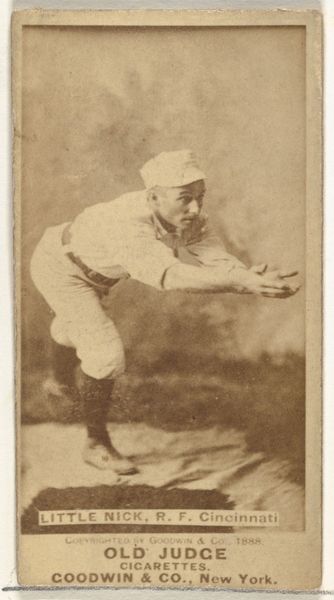
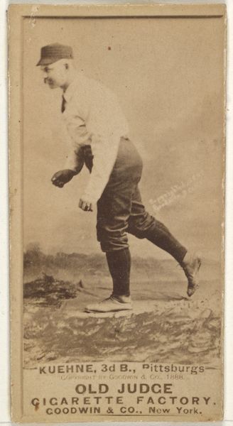
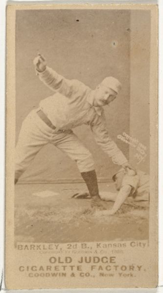
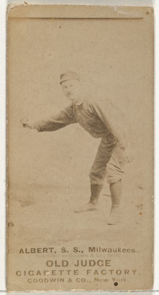
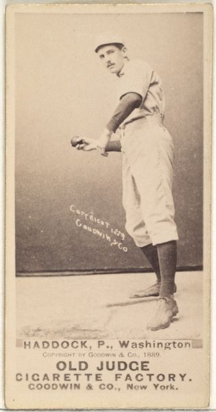
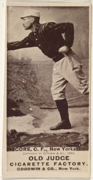
Hugh N. "Little Nick" Nicol, Right Field, Cincinnati, from the Old Judge series (N172) for Old Judge Cigarettes 1888
0:00
0:00
drawing, print, photography
#
portrait
#
drawing
#
still-life-photography
#
pictorialism
# print
#
photography
#
genre-painting
#
history-painting
#
modernism
Dimensions: sheet: 2 11/16 x 1 3/8 in. (6.9 x 3.5 cm)
Copyright: Public Domain
Editor: Here we have "Hugh N. 'Little Nick' Nicol, Right Field, Cincinnati," from the Old Judge series, dating to 1888. It's a baseball card, essentially, a photographic print used to advertise Old Judge Cigarettes. The sepia tone gives it a kind of nostalgic feeling, but I'm drawn to the somewhat awkward pose of the player. What compositional elements stand out to you? Curator: Initially, the vertical orientation of the card itself dictates the framing, forcing a somewhat compressed representation of the figure. The vignetting, where the background fades into indistinct tones, isolates Nicol, emphasizing his form. Notice the careful articulation of his musculature in contrast with the smooth, almost porcelain-like rendering of his face. It produces a strange dichotomy. Does that strike you as intentional? Editor: It does now that you mention it! It almost feels like two separate images composited together. I hadn’t considered how the limited tonal range also influences that perception. Is it an aesthetic choice? Curator: Indeed. Consider how the photographer manipulated light to define volume and texture, guiding our eye. Look at the tonal gradation of the uniform versus the sharp focus on his hands and face. It suggests an engagement with photographic modernism, prioritizing formal relationships over strict realism. Editor: So, by looking closely at the image’s elements like light, focus, and composition, you see a deliberate artistic intent rather than just a simple portrait? Curator: Precisely. We’re considering not only *what* is depicted, but *how* it's depicted. The tension between clarity and ambiguity in Nicol’s figure itself signifies an interesting commentary on form versus content. Editor: I hadn’t thought of it that way, but analyzing the structure itself reveals a much richer and more complex artwork than I initially perceived. Thanks for sharing that! Curator: A fruitful exercise, indeed. Exploring these visual dynamics is always revealing.
Comments
No comments
Be the first to comment and join the conversation on the ultimate creative platform.
More like this