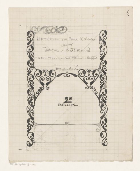
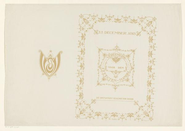
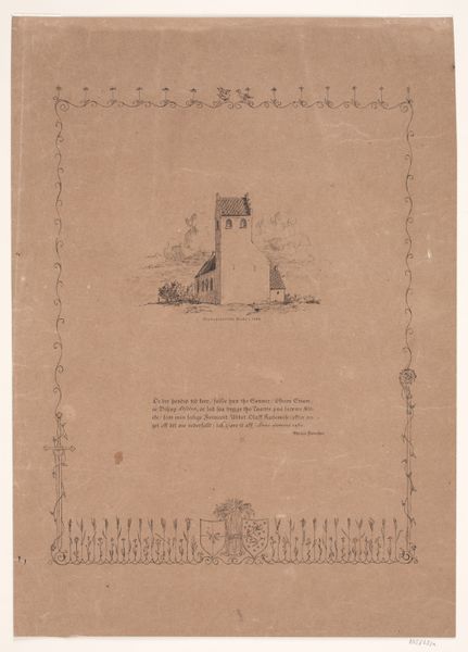
Ontwerp met bladdecoratie voor de Vereeniging voor den Effectenhandel 1913
0:00
0:00
drawing, ink
#
drawing
#
art-nouveau
#
pen drawing
#
ink
#
decorative-art
Dimensions: height 367 mm, width 279 mm
Copyright: Rijks Museum: Open Domain
Curator: This intricate pen and ink drawing is a design by Reinier Willem Petrus de Vries, created in 1913. It’s titled “Ontwerp met bladdecoratie voor de Vereeniging voor den Effectenhandel,” which translates to "Design with leaf decoration for the Association for Securities Trading.” Editor: My first thought is, what a fascinating glimpse into the visual culture surrounding early 20th-century finance. There's an air of solemnity and officialdom but softened by the delicate leaf patterns. Curator: Yes, there’s a formality inherent in its purpose. It likely functioned as an invitation or program cover for the Association’s event, as noted by the text 'De Ontvangst Geschiedde Door', which means "The reception was hosted by." The leaf motif resonates with themes of growth, prosperity, and stability. These kinds of natural symbols are pretty common to convey an impression of wealth and well-being. Editor: It makes you wonder about the intended audience, the stakeholders of this association. What did that era and this Art Nouveau style say about wealth and value to them? The fact that this is handmade adds an additional dimension: was it exclusive to higher-ups? The visual grammar speaks of class, maybe exclusion. Curator: Absolutely, the handmade quality contributes to the exclusivity. And while the Art Nouveau style evokes organic growth and flow, notice the grid underneath the decor: perhaps the visible pencil lines suggests control, like cultivation and manipulation as well, hinting at constructed markets rather than something grown freely. The controlled chaos! Editor: The decorative framing is particularly intriguing too. There's a repetition and symmetry that perhaps unconsciously reinforces systems and structures of financial exchange as ordered, reasonable…when, of course, financial realities can be far messier. Curator: I agree; the borders provide a contained and controlled presentation, a way to make something volatile feel safe. The central logo's leaf pattern has that very controlled design that looks to give an assurance to members of stability, progress, a bit of modernity even. Editor: For me, seeing this juxtaposition of nature and high finance encourages deeper questions about capital itself: Who benefits? At what expense? How does power and ideology intertwine within systems that claim to be apolitical? Curator: Exactly, these visual markers of value open conversations about the values we attach to capital and what those values signify culturally and politically. Editor: A reminder that images are never neutral and offer a glimpse of past meanings still in play today. Curator: Indeed. It showcases that finance, just like anything, operates within a culturally shaped and visually represented world.
Comments
No comments
Be the first to comment and join the conversation on the ultimate creative platform.
More like this