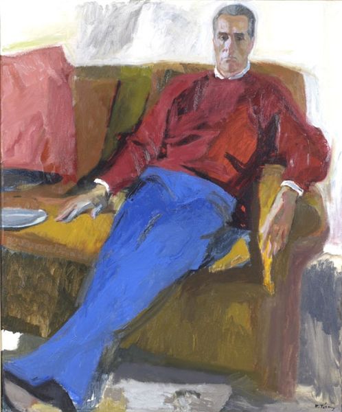
painting, oil-paint
#
portrait
#
painting
#
impressionism
#
oil-paint
#
pop art
#
figuration
#
oil painting
#
sitting
#
portrait art
#
modernism
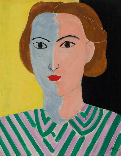
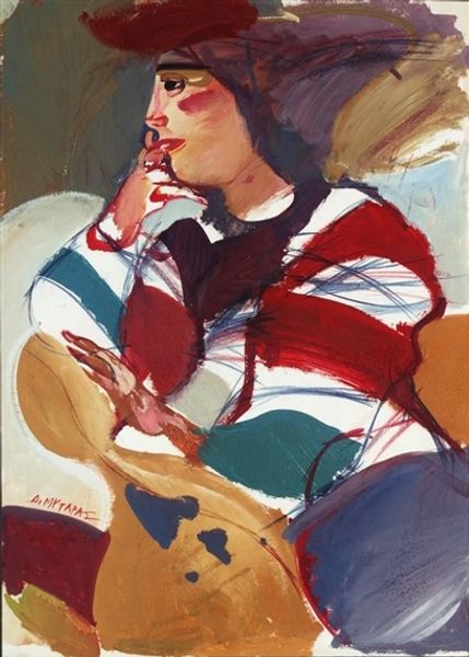
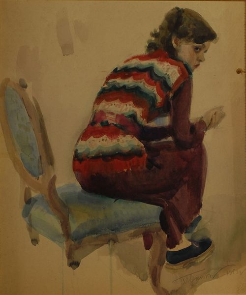
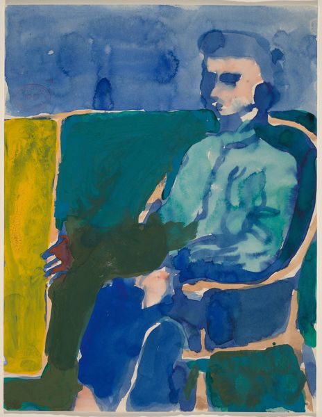
Copyright: Louisa Matthiasdottir,Fair Use
Curator: Here we have Louisa Matthiasdottir’s painting, "PORTRAIT", rendered in oil on canvas. It's a captivating, almost assertive figure study. What are your first thoughts? Editor: The most striking aspect is the bold colour palette, isn't it? Juxtaposed against the neutral backdrop, the bright stripes on the subject’s sweater and the slightly bizarre hat, well, they certainly command attention. The artist isn’t afraid to flatten the space. Curator: Indeed. Matthiasdottir creates a vibrant representation, using the colours as symbolic markers of her sitter’s personality. The red hat speaks to a fiery spirit, and the mix of blues and greens may reflect both stability and growth, perhaps an active, fertile mind. The simplified forms encourage us to look beyond the surface appearance. Editor: That's quite plausible. But what intrigues me is the texture—or rather, the relative lack thereof. There are such distinct, delineated planes of colour. Notice the brushstrokes are direct and purposeful, not blended or softened as we might expect in traditional portraiture. This intensifies the emotional impact by emphasising the construction of the image itself, pushing us to ask what representation even means here. Curator: Consider her Icelandic background, a landscape shaped by strong light and shadow, which could well translate here into distinct planes and blocks of colour. Beyond technique, she communicates resilience. Notice the subject’s pose – hand confidently on hip, direct gaze… she embodies strength. The colours become a kind of shield. Editor: It also evokes certain stylistic trends from Pop Art. Look how Matthiasdottir utilizes flat planes and intense colour to remove nuance. The woman’s individuality isn’t about interiority. It’s about the image presented: vivid, uncomplicated, immediately readable, even humorous. The effect isn't just psychological; it also makes the sitter appear approachable. Curator: That reading emphasizes a fascinating paradox: that Matthiasdottir both simplifies and amplifies the subject through her colour choices, crafting an emblem of stoicism tinged with humor. It's a statement of presence, resisting sentimentality in favour of an immediate connection. Editor: I concur. We start with an intriguing assembly of shapes and colours, and gradually perceive an echo of boldness of character through visual structure and representation.
Comments
No comments
Be the first to comment and join the conversation on the ultimate creative platform.
More like this