Copyright: Verena Loewensberg,Fair Use
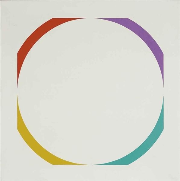
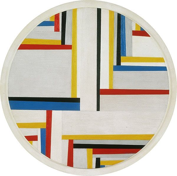
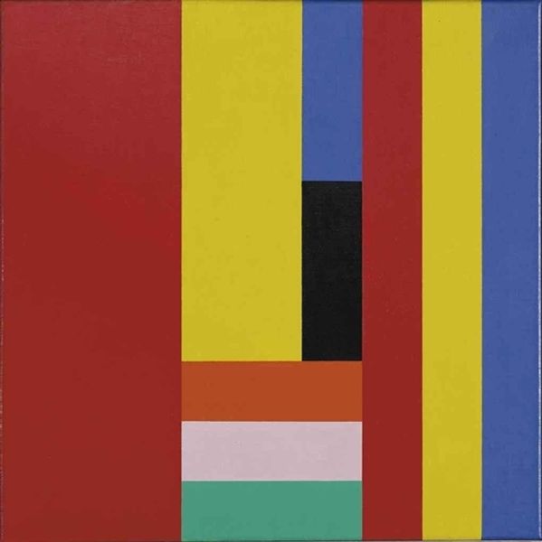
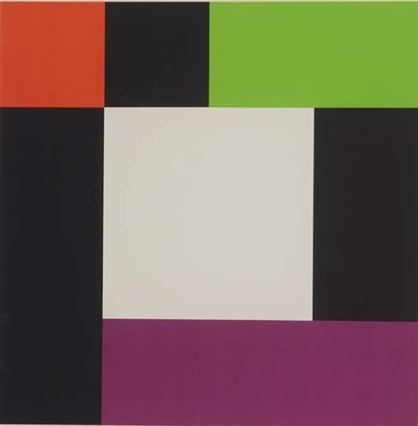
Curator: This work, simply titled "Untitled," was created by Verena Loewensberg in 1973. It strikes me as an essay in pure geometry. Editor: It feels almost clinical at first glance. But the more I look, the more the materiality pulls me in. You can almost feel the layers of color, the texture of the paint, it makes you want to study her technique. Curator: Note how the severe geometric forms, that stark circle and sharp, colourful lines, work in concert with the underlying symbolic order. Doesn’t the central white circle echo wholeness, the infinite? Consider how geometric abstraction, especially prevalent at this time, offered a purified language… Editor: ...but let’s not overlook the tangible. The lines of color aren’t perfectly uniform, suggesting the presence of a human hand in applying the materials. And what exactly are those materials? The surface is too smooth to be purely paint on canvas. The means of production feel very deliberate here. Is it a screenprint, perhaps? It gives an impression of mass reproducibility, while remaining visually refined. Curator: True, but there is also a sense of timelessness within the work, beyond reproducibility. Colour itself, reduced to its primary essence – the blue, yellow and red; not to forget the solid black - takes on its own iconic presence, wouldn't you agree? They create, within the frame, a subtle rhythm that's almost meditative, contrasting with the apparent flatness. It reminds me of the color field painting of the period. Editor: Meditative, maybe, but also undeniably calculated. The visual balance between positive and negative space is precise. Where do these simple lines and colours get their cultural cachet? We tend to ascribe artistic skill to unique painterly gestures, but how do we interpret this careful—dare I say, manufactured—balance? Curator: It's a great reminder that visual language is ever-evolving, and geometric shapes have deep roots in our shared, visual vocabulary, from sacred geometry to modern logos. We are primed to find meaning, you know, to overlay familiar stories. Editor: I am drawn to the challenge the work presents; how it balances hand-made materiality and industrial means, high art and functional design. Curator: Yes, it offers so much more than first meets the eye; there’s both order and a delicate suggestion of openness to new interpretation.
Comments
No comments
Be the first to comment and join the conversation on the ultimate creative platform.
More like this