drawing, coloured-pencil, print
drawing
coloured-pencil
mannerism
figuration
coloured pencil
history-painting
Dimensions: height 155 mm, width 115 mm
Copyright: Rijks Museum: Open Domain
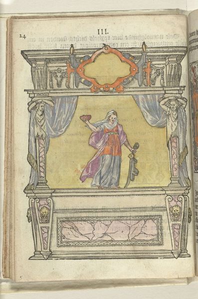
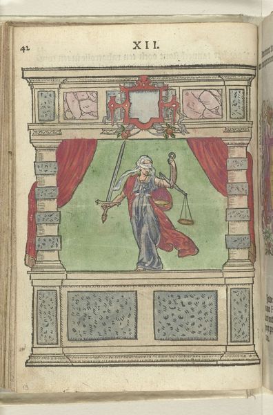
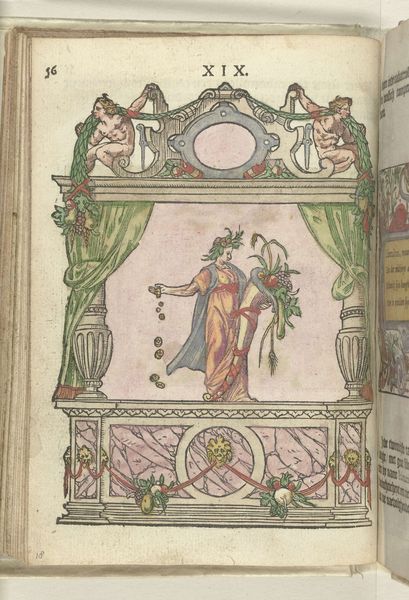
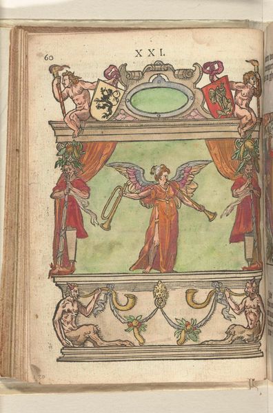
Curator: Antoni van Leest's "Toneel met personificatie van de Kracht (Fortitudo)", dating from 1578-1579, certainly presents a fascinating spectacle. What’s your first impression of the piece? Editor: The staging is what immediately strikes me – a literal stage, it seems, meant to present 'Fortitudo.' The palette is muted, primarily pale reds, yellows and greys, giving it an almost theatrical quality. But, look at the composition: quite rigid and structured, the figure presented is very formal. Curator: Precisely. Notice how the artist utilizes color-pencil techniques to emphasize form and texture? The folds of Fortitudo's garment, the fractured pillar she supports – the colored-pencil both delineates and softens, guiding the eye strategically. Consider how Mannerism revels in complexity. Editor: I see what you mean. Thinking of it as "theatre", it places "Fortitudo" and, of course "Power", front and center, likely reflective of the anxieties and power plays within 16th-century society where such virtues were desperately needed during times of religious and political strife. But I wonder who exactly the target audience was for a symbolic image like this? Curator: Ah, an excellent question! We can tell from this colored-pencil and print composition, and the prominent figure on display, the intent of history-painting within a very elite, probably intellectual, circle during a tumultuous period of power struggles. What message did van Leest want to convey with that staging, beyond "Power"? Editor: Well, perhaps he hoped to solidify power and present it as unshakable strength within political unrest of that period? In that setting, the pillar representing Power is intentionally fragmented! What I keep coming back to are those rather odd coats of arms on each upper corner of the piece: almost as if ‘Power’ can come from different people or directions depending on the circumstances. The use of print allowed distribution to a wide but powerful base... Curator: Indeed. Print media as a method of wider circulation absolutely speaks to accessibility of imagery to that influential core, while maintaining quality due to colored pencil's fine qualities. A potent combination serving very practical functions. I’m quite drawn to the internal symmetry around a blank frame. It speaks volumes to possibilities of power to me, depending on circumstance… Editor: A really apt description that adds many possibilities to how one could interpret this presentation and "Personification of Power." Thank you. Curator: My pleasure, every visual consideration illuminates both van Leest's methodology as well as how art fulfills and enhances social necessities!
Comments
No comments
Be the first to comment and join the conversation on the ultimate creative platform.