drawing, ink, engraving
#
drawing
#
baroque
#
pen drawing
#
ink
#
geometric
#
ink colored
#
pen work
#
decorative-art
#
engraving
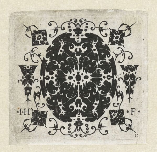
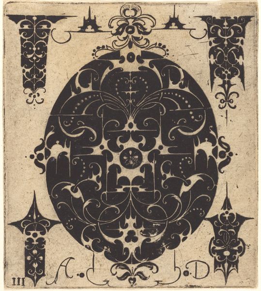
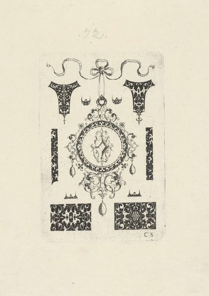
Dimensions: height 72 mm, width 69 mm
Copyright: Rijks Museum: Open Domain
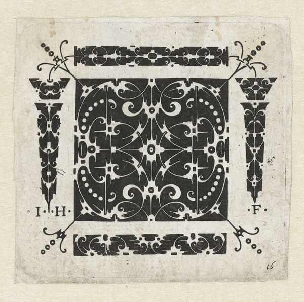
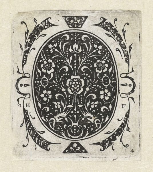
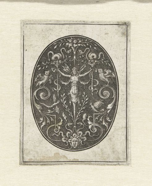
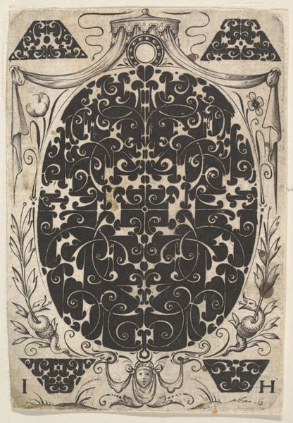
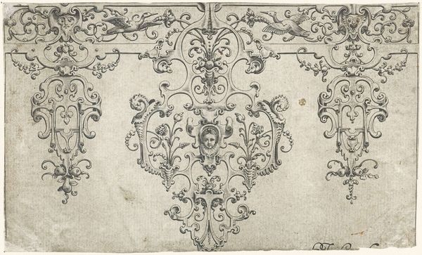
Curator: Let’s examine "Hartvorming pendentief en elf kleinere motieven," created in 1619 by Jacques Hurtu. It’s an ink drawing now held at the Rijksmuseum. Editor: My first thought is that it looks like a tattoo design—something elaborate from the Baroque period, almost aggressively decorative. The crisp lines contrast sharply with the blank paper. Curator: Precisely. We have to consider the history of ornament in the 17th century. Ornament wasn't just adornment; it was tied to social status, religious symbolism, and political power. Editor: I am curious about the process, the engraving marks look intentionally assertive. It speaks of the craftsperson's agency, the skill in controlling the tools and materials available. This feels like an exploration of material limits and technical virtuosity. Curator: Exactly. Engravings like this were crucial in disseminating designs, acting as pattern books for artisans and even for embroidery. This goes far beyond aesthetics; we're talking about labor, class, and how artistry enters the social and domestic sphere. How would an artisan during Hurtu's time interpret such forms? Editor: It also speaks to a specific visual language, one which relies on precision but also understands the intrinsic qualities of ink and paper. How the ink bleeds slightly, the physical impression left behind; that all impacts our reception. It shows the limitations of print and how those constraints inform design. Curator: And thinking about gender, who was consuming these images? Were women adapting them for needlework? Did these designs uphold or challenge conventions? How do notions of domesticity, artistry and class intersect? Editor: Considering all of those elements opens avenues for discussing the broader historical context and material conditions that this print both emerged from, and helped shape. Curator: Precisely. It makes one reconsider the apparent frivolity of Baroque design. Editor: Agreed. And how this small object encapsulates grand narratives around labor and status.
Comments
No comments
Be the first to comment and join the conversation on the ultimate creative platform.
More like this