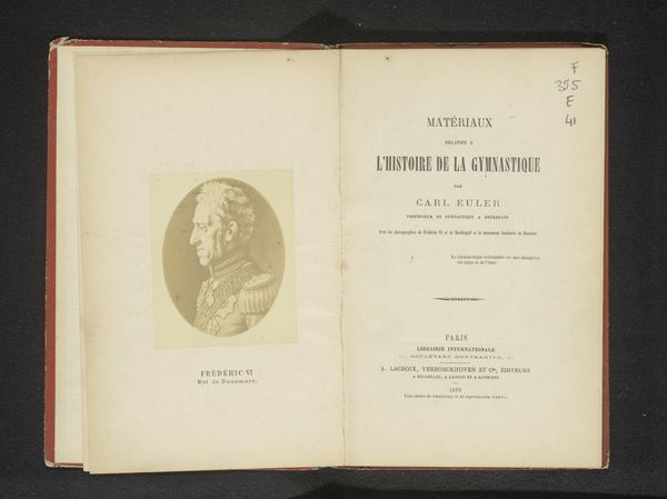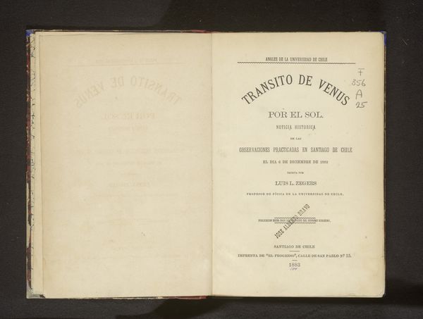
graphic-art, print, photography, typography
script typeface
graphic-art
aged paper
french
old engraving style
personal journal design
photography
personal sketchbook
typography
hand-drawn typeface
thick font
handwritten font
golden font
modernism
historical font
Dimensions: height 199 mm, width 134 mm, thickness 9 mm
Copyright: Rijks Museum: Open Domain
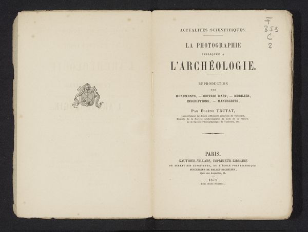
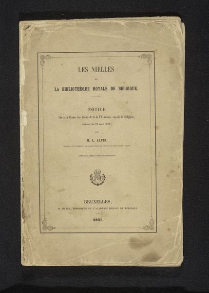
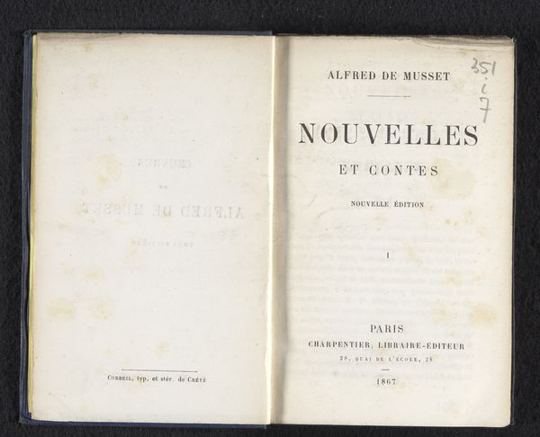
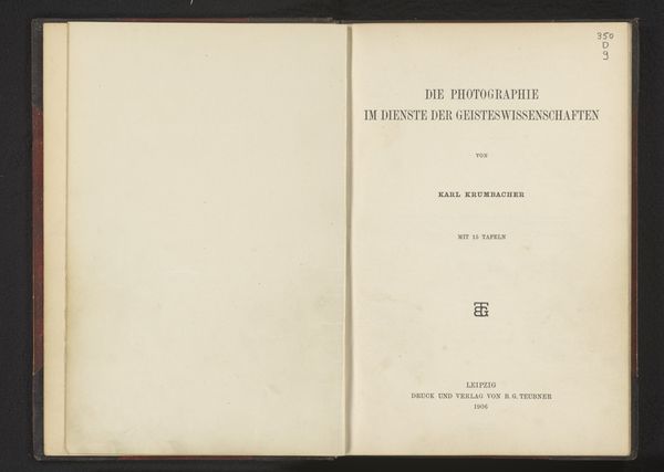
This is the title page for ‘La procédé à l'huile’ by Constant Puyo. The off-white paper invites us into a world where process takes center stage. Typography here isn't just about communication, it's about texture and form. Notice how the ink sits slightly raised on the page. The bold strokes of "PROCÉDÉ" are confident, while the smaller text underneath adds a layer of complexity. The seal of the publisher Charles Mendel sits in the middle of the page, a microcosm of detail, inviting closer inspection and promising the knowledge within. Think of the page as a canvas. The words are like brushstrokes, carefully placed to build an image. It's about how these elements come together to create an experience, a feeling. It reminds me of other process-based artists like Sol LeWitt who created systems to dictate the marks in their work. This page isn’t just an introduction, it’s an invitation to consider the act of making itself.
Comments
No comments
Be the first to comment and join the conversation on the ultimate creative platform.
