Copyright: Modern Artists: Artvee
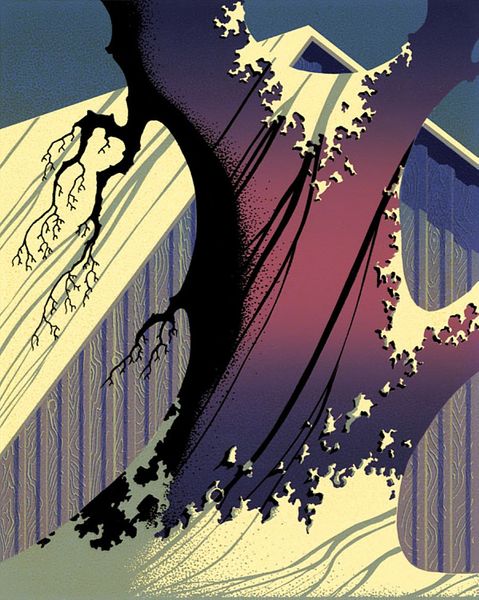
Robert Sammelin made this poster for the film The Matrix sometime in the 20th century, and it dives headfirst into bold shapes and contrasting colors. It's not about subtle blending here, but about how clean lines and blocks of color can create depth and drama. It's like a graphic novel exploded onto a poster. I'm really drawn to how the blacks and the pinks play off each other. It makes the mechanical tentacles look almost playful, until you realize they're snaking around Neo, who is captured mid-leap. The cracked pavement beneath him is rendered with such sharp angles, you can almost feel the tension. The artist is controlling the chaos. Looking at Sammelin's poster, I am reminded of the work of Paul Rand, particularly his IBM posters. Both artists have this knack for distilling complex ideas into striking visual form. They demonstrate how reduction can speak volumes, letting the audience fill in the blanks with their own experiences. It’s a conversation, not a lecture, and that's what makes the piece so engaging.
More like this