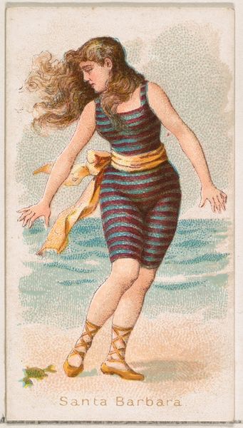
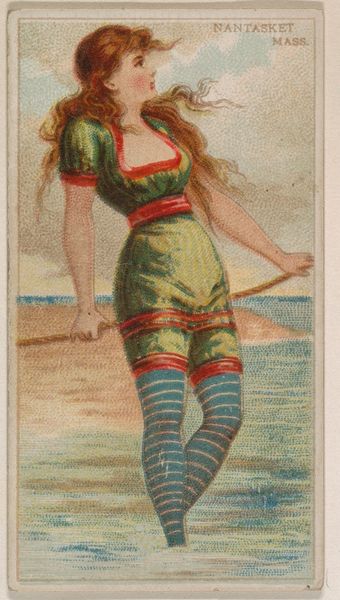
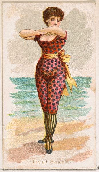
Rockaway, Long Island, from the Surf Beauties series (N232), issued by Kinney Bros. 1889
0:00
0:00
drawing, coloured-pencil, print
#
portrait
#
drawing
#
coloured-pencil
# print
#
figuration
#
coloured pencil
#
orientalism
#
genre-painting
#
watercolor
#
profile
Dimensions: Sheet: 2 3/4 × 1 1/2 in. (7 × 3.8 cm)
Copyright: Public Domain
Curator: What a captivating image. This is "Rockaway, Long Island, from the Surf Beauties series," created around 1889 by the Kinney Brothers Tobacco Company. It’s a colored print, likely used as a promotional card. What are your first thoughts? Editor: My immediate impression is of a very posed, self-conscious image, despite the breezy beach setting. There’s something almost doll-like about her stance. It strikes me as oddly modest but also carefully constructed for the male gaze, which makes it such a captivating paradox. Curator: Precisely! The "Surf Beauties" series, like many advertising images of the time, operated in complex social terrain. This card presented a carefully curated vision of leisure and desirability. Editor: It’s fascinating how even something like swimwear becomes symbolic. Those bold stripes could represent her liberation, a break from Victorian stuffiness. But that high neckline and long sleeves...it’s still very constrained. It’s like a compromise between freedom and propriety, that feels particularly symbolic. Curator: That tension is key. These images weren't just about selling tobacco; they reflected and reinforced contemporary ideas about femininity, leisure, and emerging consumer culture. Rockaway, as a beach destination, was becoming increasingly popular, and this image linked the promise of modern leisure with the consumption of their product. Editor: And look at her direct gaze, but it’s averted… Her ginger hair looks unrestrained. Those colours! Even her bathing machine or the bucket left on the shore feel loaded with social meaning about what sort of activity women were "allowed" to participate in at the beach. What do you read from this image? Curator: To me, it serves as a window into a very specific historical moment. We see a collision of industrial capitalism, burgeoning mass media, and shifting gender roles playing out on a popular beach, distilled into a small, collectible card. The layering is truly complex and fascinating. It allows a better sense of the period than just simple portraiture. Editor: Absolutely. Analyzing the visual symbols—the fashion, the seaside elements, the subject's pose—offers layers of understanding and speaks volumes about the ongoing push and pull of cultural forces then, and even, now. Curator: Well, looking at this closely really reveals the layers upon layers that go into what looks like a simple little advertising card.
Comments
No comments
Be the first to comment and join the conversation on the ultimate creative platform.
More like this