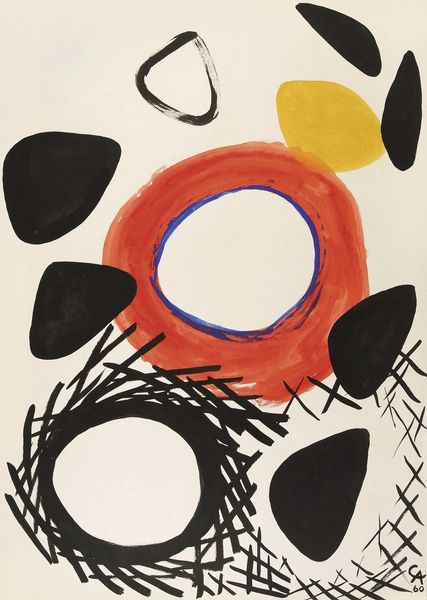
acrylic-paint
#
abstract-expressionism
#
non-objective-art
#
pop art
#
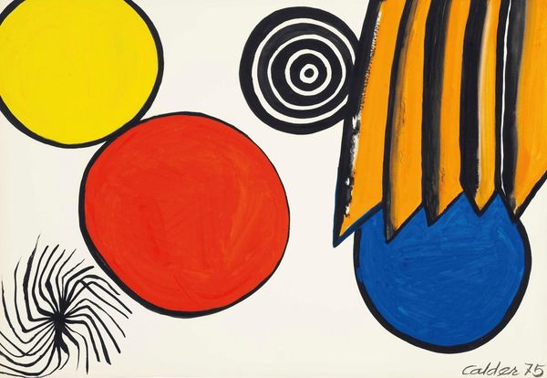
acrylic-paint
#
abstract
#
form
#
geometric
#
pop-art
#
line
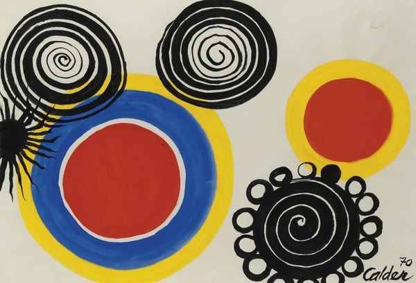
Copyright: Modern Artists: Artvee
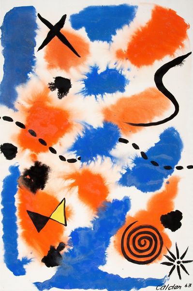
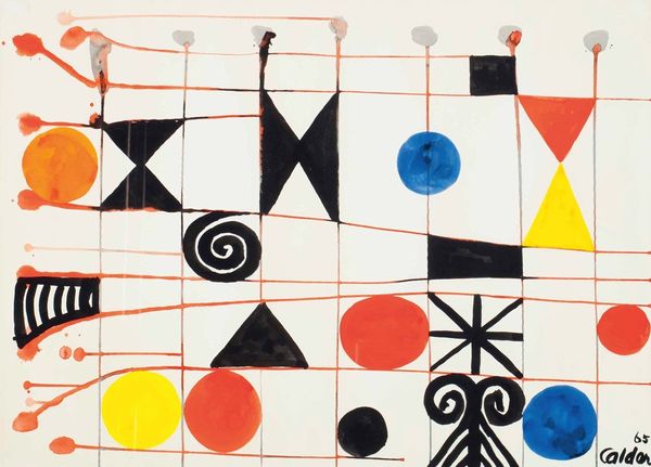
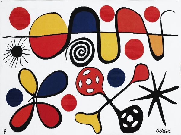
This is The Blue C by Alexander Calder, made in 1969. Just look at those playful shapes and colours. It’s like Calder’s mobiles decided to take a break and have a party on paper. I’m really drawn to the way Calder uses colour here; the bold blues, yellows, and oranges feel so immediate, almost childlike. The paint isn't trying to be anything it’s not, and there is real honesty in that. See how the ink bleeds and drips? It's as if Calder let the materials lead the way, embracing chance and accident. And there’s that spidery black figure at the bottom – it’s like a doodle come to life, anchoring the composition. When I look at this, I’m reminded of Joan Miró, another artist who knew how to make the absurd feel profound. Calder, like Miró, invites us to see the world with a sense of wonder and possibility. It's all about keeping it open.
Comments
No comments
Be the first to comment and join the conversation on the ultimate creative platform.
More like this