Copyright: Public Domain: Artvee
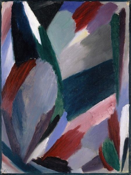
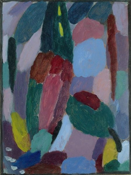
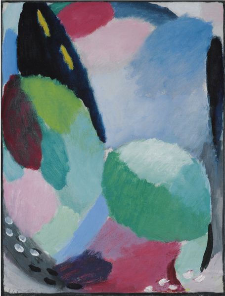
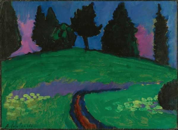
Editor: Here we have Alexej von Jawlensky’s "Variation No. 10," created in 1916 using oil paint. I’m struck by the simplicity of form and how the colors almost vibrate against each other. What catches your eye in this work? Curator: The interplay of pure, unmodulated color is certainly compelling. Notice how Jawlensky employs discrete blocks of color – blues, greens, pinks – with little to no blending. The arrangement verges on abstraction, doesn't it? One can see hints of landscape forms, perhaps, but the essence lies in the chromatic relationships themselves. What kind of effect does that create for you? Editor: It does feel like a distilled landscape. The blocks almost become symbols for real forms. But it does lead me to focus more on the individual shapes themselves, and less on recognizing the real world. Curator: Precisely. Observe how the artist structures the composition: the vertical thrust of the green, countered by the horizontal blues and reds below. Are there elements of dissonance created through the relationship of line to colour? Is there a disruption within the planes? Editor: I hadn't considered the interplay of lines like that before. There is a gentle disturbance caused by the lack of alignment with the colour forms. I’m also fascinated how simplified it all is, stripping down forms to their barest essentials. Curator: Yes. And it is within that very reduction that its power lies. The artist uses a simplified visual vocabulary to evoke the potential of colour relations and form to hold aesthetic interest without recourse to traditional pictorial devices. Now, when you stand back and consider the totality of colour forms and structure – what conclusions can you extract? Editor: I think it shows that art can be impactful, and challenge our vision and conceptions, with simplicity. Curator: Exactly. Jawlensky has distilled a profound visual experience.
Comments
No comments
Be the first to comment and join the conversation on the ultimate creative platform.
More like this