drawing, ink, pen
#
landscape illustration sketch
#
drawing
#
aged paper
#
dutch-golden-age
#
mechanical pen drawing
#
pen sketch
#
old engraving style
#
sketch book
#
landscape
#
personal sketchbook
#
ink
#
pen-ink sketch
#
sketchbook drawing
#
pen
#
cityscape
#
storyboard and sketchbook work
Dimensions: height 150 mm, width 179 mm
Copyright: Rijks Museum: Open Domain
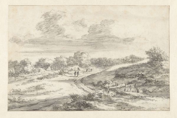
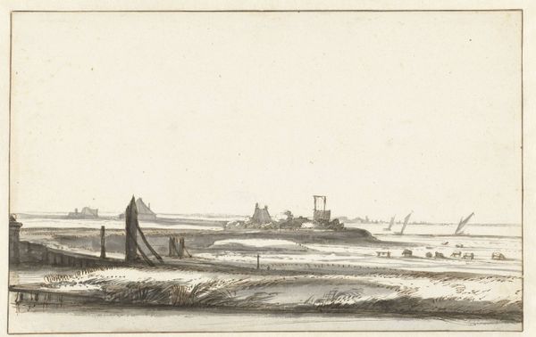
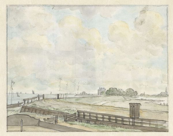
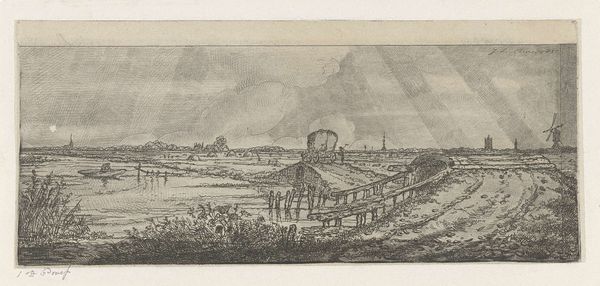
Editor: We're looking at "View of the Bospoort, Bergen op Zoom," a pen and ink drawing possibly from 1671 by Barend Klotz. It feels almost like a study, capturing this fortified entrance to the city. What strikes you about its composition? Curator: Note the precise rendering. The artist clearly prioritized linear accuracy, carefully depicting the orthogonal lines of the architecture. The texture is built through repetitive hatching and cross-hatching. Observe how the lines become denser in the shadows, lending a three-dimensionality to the otherwise sparse rendering. Is it successful in creating depth, would you say? Editor: I think so, although the limited tonal range keeps it very much on the surface. What about the subject matter itself? Is the city gate symbolic in some way? Curator: In a formalist reading, the symbolism of a gate is less relevant than its role in the composition. Notice how the Bospoort acts as a visual anchor, strategically placed slightly off-center to create dynamic tension. It controls the spatial organization and our reading of the piece, wouldn’t you agree? The eye moves toward it, then disperses into the details of the landscape. Editor: That makes sense. So, even without knowing the history, the gate’s prominence draws us into the work. The bridge feels especially delicate when placed alongside the fort itself. Curator: Precisely. The artist seems invested in conveying the interplay between structural rigidity and the fluidity of the natural world. It's a play of form, isn't it? How these disparate elements resolve into a unified visual experience is a formal triumph, really. Editor: It’s fascinating how much you can analyze just by looking closely at the lines and shapes. I definitely see the artist’s intention to balance contrasting elements now. Curator: Indeed, analyzing its forms grants a rewarding glimpse into Klotz’s artistic sensibilities and, by extension, our own perceptual frameworks.
Comments
No comments
Be the first to comment and join the conversation on the ultimate creative platform.
More like this