engraving
#
portrait
#
baroque
#
dutch-golden-age
#
old engraving style
#
caricature
#
figuration
#
line
#
history-painting
#
engraving
#
realism
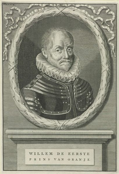
Dimensions: height 270 mm, width 179 mm
Copyright: Rijks Museum: Open Domain
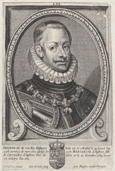
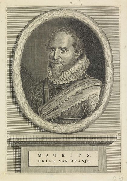
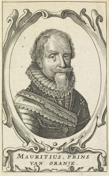
Curator: Here we have an engraving from 1677 entitled "Portret van Willem I, prins van Oranje," or "Portrait of William I, Prince of Orange," made by an anonymous artist. What are your initial thoughts on it? Editor: There’s a certain stoicism that emanates from this piece, doesn't it? Despite the intricate details, particularly in the ruffled collar and the armour, it feels…restrained. I’m curious, what were engravings like this used for at the time? Curator: They were crucial tools for disseminating images and ideals, acting almost like the social media of their day. This image of William I, for example, would have circulated widely, shaping public perception and reinforcing his authority after his death. The labor involved, from the initial design to the meticulous carving of the metal plate, speaks to the importance of visual messaging. It served to codify what “leadership” should look like. Editor: It's interesting how the print presents William, this iconic figure, within such a defined, almost rigid frame. I wonder how that framed-ness impacts our interpretation. To me, it underscores how history remembers leaders. William is separated by his frame and marble platform as an 'example' rather than a real living individual who suffered losses and missteps. And what are we meant to glean from this text at the bottom? Curator: The inscription offers a laudatory summary of his virtues: prudence, love, diligence, patience, modesty. It idealizes William as the savior of the people, linking his reign with their hard-fought freedom and almost placing him within the space of a godhead by lauding his sacrifices to his "flock" of the nation. I am more concerned about the conditions under which the printer or engraver created it and to what audience were the prints meant for, particularly. These are generally questions concerning working people versus the ruling class. Editor: Yes, the material conditions of production certainly add another layer to unpack here. How can we read the choices of line quality and shading in light of social history? Thank you for expanding my appreciation of the work! Curator: Of course! Understanding this image as a product of labor, within a network of materials and their distribution, highlights that no artwork is ever truly separate from the world it exists within.
Comments
No comments
Be the first to comment and join the conversation on the ultimate creative platform.
More like this