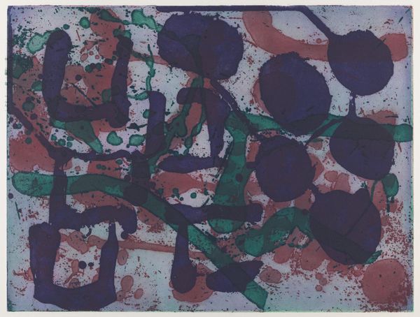
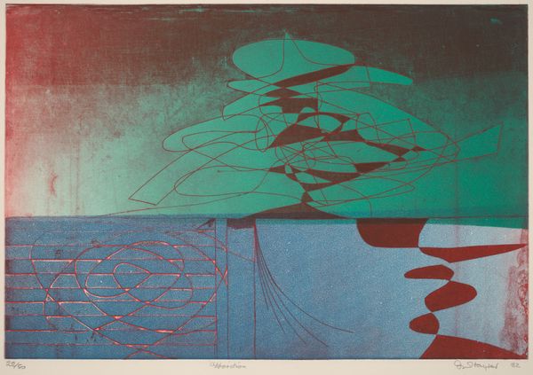
graphic-art, print, impasto
#
graphic-art
#
abstract painting
#
canvas painting
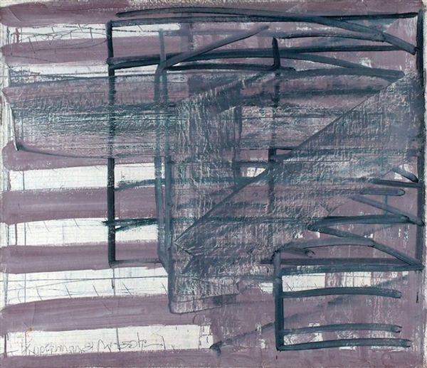
# print
#
form
#
impasto
#
linocut print
#
geometric-abstraction
#
line
#
modernism
#
monochrome
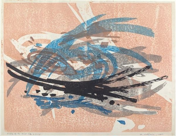
Dimensions: overall: 49.8 x 60.5 cm (19 5/8 x 23 13/16 in.)
Copyright: National Gallery of Art: CC0 1.0
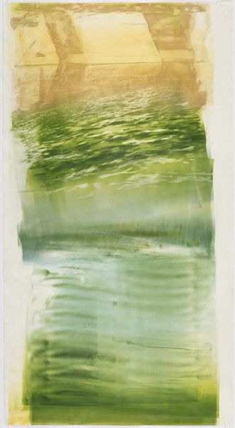
Curator: Josef Hlavácek’s 1992 print presents an interesting interplay of horizontal lines, alternating mostly in hues of green and dark greys, upon a muted background. It’s titled simply, "Untitled". Editor: It strikes me as a landscape viewed from above. Are those rolling hills or maybe riverbeds cut into the earth? There’s an energy that’s simultaneously soothing and disquieting. Curator: That tension speaks to the history embedded in landscape art. Remember, landscapes aren’t neutral views. They’re laden with cultural memory, ownership, and ideology. The green perhaps signals fertility, growth, life itself. Editor: While the form seems quite free and loose at first, it adheres to an organization around the horizontal, using a simple and rather limited palette. Can you speak about the material itself, how he built up the surface? Curator: Hlavácek used linocut, a type of relief printmaking. In it, the artist carves away sections of linoleum, leaving the raised areas to receive the ink. Look closely, and you will find this technique lends a certain tactile quality, visible in the impasto texture of the print. Editor: The line itself is particularly important. We see an interesting dichotomy, where the bold, almost aggressive swathes of color, particularly that vivid green, contrast with the delicate web of white scratches on the overpainted surface, acting almost as a sort of "corrective" grid. Curator: Those deliberate "scratches," are very intriguing. It suggests the mark of time, a palimpsest of lived experience layered over the ideal, perhaps challenging the very notion of a pristine, untouched landscape. It evokes both creation and destruction, a recurring cycle found in nature. Editor: In all, the horizontal orientation certainly grants the work its visual weight. It also helps define those dynamic and vibrant colors that provide a dramatic depth across the whole of the image. I must confess, I didn't notice how captivating its materiality would be from a distance. Curator: Indeed, the symbols and their interaction create more than what first meets the eye; they weave a dialogue between ourselves and the landscapes we inhabit. Editor: I'm convinced the work, through the bold yet simple lines, creates a certain aesthetic depth, with its composition more complicated than previously apparent.
Comments
No comments
Be the first to comment and join the conversation on the ultimate creative platform.
More like this