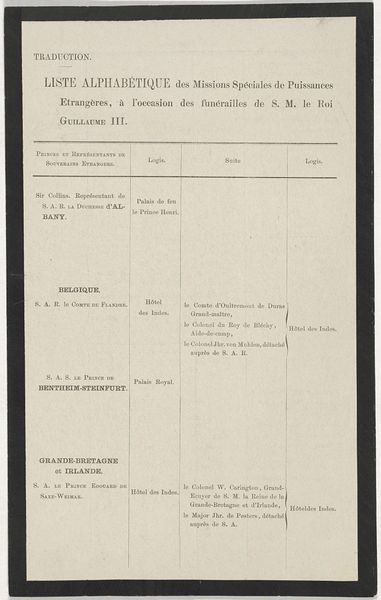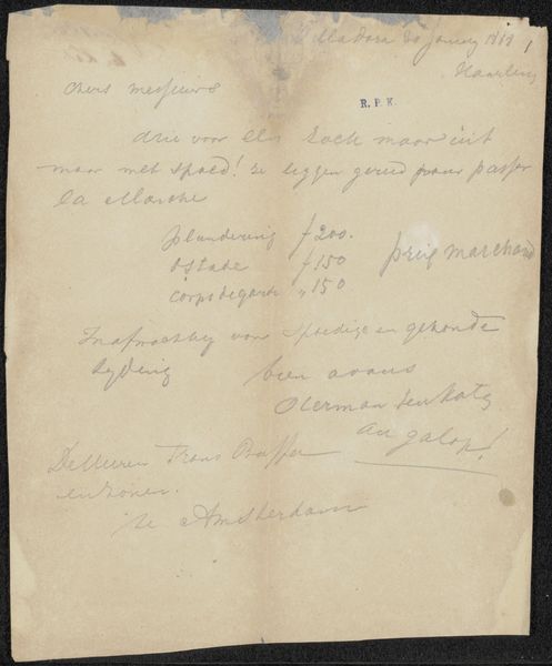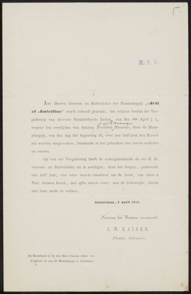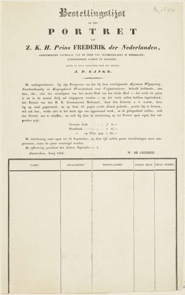
Possibly 1914
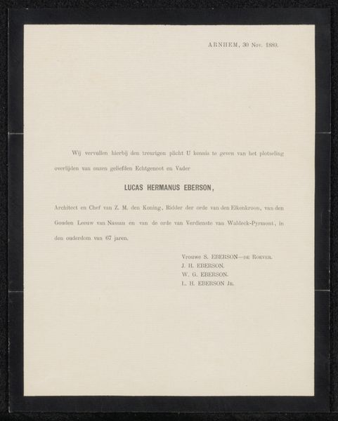
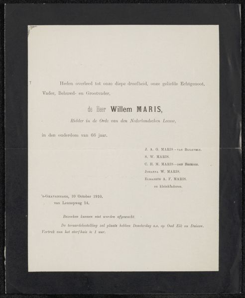
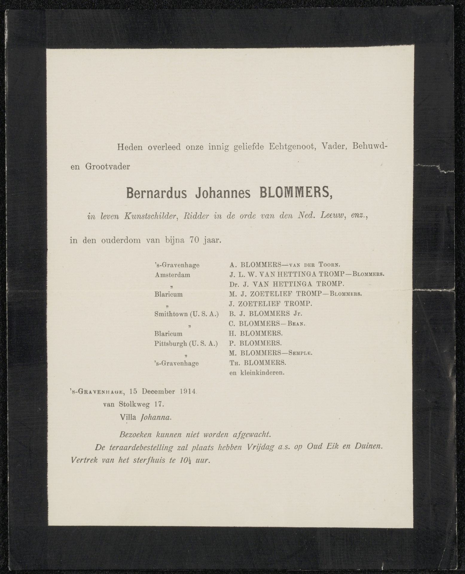
Overlijdensbericht van Bernardus Johannes Blommers
Anonymous
@anonymousLocation
RijksmuseumListen to curator's interpretation
Curatorial notes
This bereavement card for Bernardus Johannes Blommers, a painter, probably dates from 1914. What strikes me is its graphic design. Anonymous as it is, it's a fascinating piece of art, revealing the process of laying out text, choosing a font, and considering the visual impact of words on paper. Look at the way the information is arranged, a hierarchy of importance. The name boldly centered, followed by familial roles, and then a list of mourning relatives. The texture of the paper, its slight imperfections, and the ink's subtle variations—these are the material aspects that give the card its weight. The density of the type feels, formally, like a dark wash, and the negative space it creates around the type like a pale, soft colour. It’s almost like a somber watercolor by someone like Agnes Martin, where the deliberate arrangement of lines and shapes evokes a quiet, contemplative mood. This little card becomes a quiet, contemplative moment.