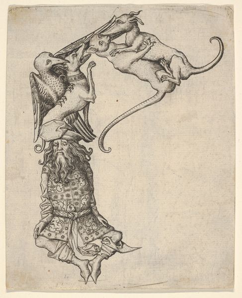
graphic-art, print, engraving
#
graphic-art
#
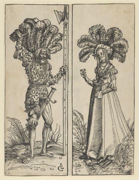
medieval
#
pen drawing
# print
#
figuration
#
ink drawing experimentation
#
pen work
#
engraving
Dimensions: sheet (cut within platemark): 14.4 × 11 cm (5 11/16 × 4 5/16 in.)
Copyright: National Gallery of Art: CC0 1.0
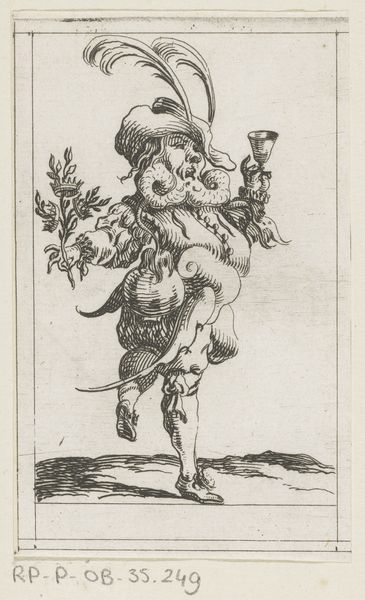
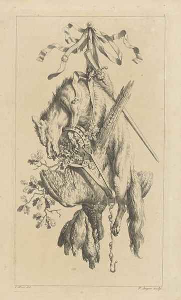
Curator: This intriguing print is titled "The Letter 'K'," an engraving dating back to around 1466-1467 by Master ES. What strikes you immediately about it? Editor: The density! It’s absolutely crammed with detail. There's almost no untouched space, and this overwhelming embellishment feels somehow both opulent and unsettling. All those wiry lines mimicking texture... what material was used for this print? Curator: This piece comes to us through the graphic arts medium of engraving, showcasing some of the earliest experimentation in ink drawing. Master ES really pushed the boundaries. These "alphabet prints" were fashionable; they fulfilled a vital public need, to be broadly useful. Editor: Engraving allowed for reproducibility, right? So the 'K' wasn’t necessarily precious or unique—more a tool, readily available to many, for educational or perhaps even decorative purposes. Look at the figures: Are they truly 'human'? Dressed in vegetation, clinging to this constructed 'K' frame? Are they enslaved or empowered by this service they're expected to do? Curator: A crucial thing is understanding their socio-political roles. The figures are often interpreted as "wild men" popular figures in Medieval art and courtly entertainments, emblems of untamed nature contained by culture. Master ES seems interested in both, in blending wildness and refinement as status symbols. This "K" has so many stories contained within. Editor: Status indeed! That fox, too, is deliberately placed: Not just to fill space but signifying wealth in fur trade, so fashion in medieval times and an upperclass display. You have raw animal and "tamed" symbolic humans. Interesting comment about control vs freedom. Curator: Yes, and consider how it would have been perceived within the cultural norms of the time. Its public visibility then allowed it to circulate widely—not just a single act of artistry, but one which helped to shape cultural taste and knowledge. How do you understand all this dense detail within this "letter"? Editor: It highlights a real tension. You're stuck by its purpose as a 'letter', constrained by design yet trying desperately break free through ornamentation. It feels a physical labor – forcing this much life into such confined a graphic space... A bold artistic statement, indeed.
Comments
No comments
Be the first to comment and join the conversation on the ultimate creative platform.
More like this