drawing, pencil
#
shading and hatching
#
portrait
#
drawing
#
quirky illustration
#
childish illustration
#
shading to add clarity
#
old engraving style
#
figuration
#
personal sketchbook
#
ink drawing experimentation
#
geometric
#
pencil
#
line
#
sketchbook drawing
#
cartoon style
#
sketchbook art
#
modernism
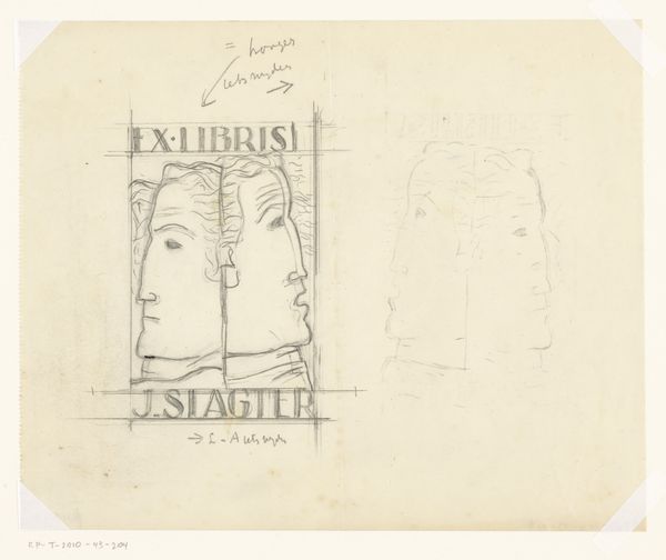
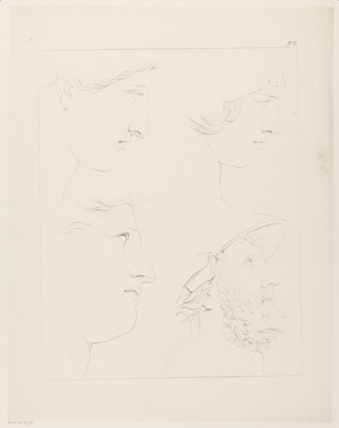
Dimensions: height 196 mm, width 135 mm, height 155 mm, width 110 mm
Copyright: Rijks Museum: Open Domain
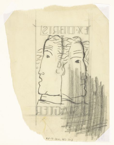
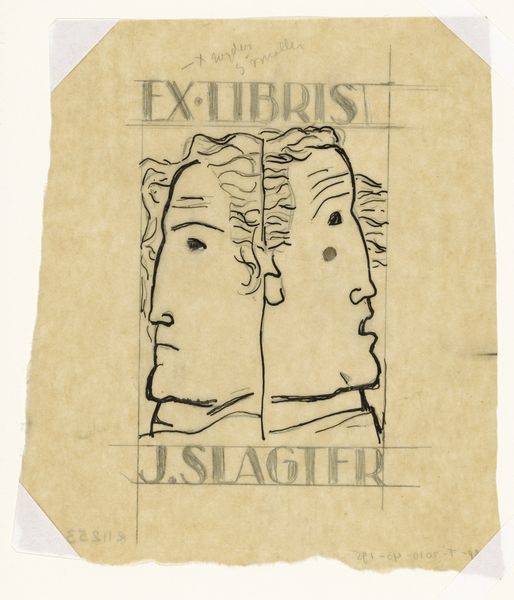
Leo Gestel made this Ex libris voor J. Slagter design with graphite. What strikes me here is how Gestel uses a simple graphite line to suggest these almost classical faces. It’s fascinating how much information our brains fill in with so little prompting. The subtle variations in the pressure of the graphite, the slightly uneven lines, they give the drawing a kind of vulnerable quality. I’m drawn to the way the faces are bisected by a vertical line, making it hard to know if it is a double portrait or two faces. I think it highlights the iterative nature of design, as the artist is working through different options, refining, and adjusting until the image resolves itself. It’s a reminder that art-making is a process of discovery rather than just a fixed idea executed perfectly. Gestel's contemporary, Mondrian, used a similar reductive approach to form making, though on a much grander scale. Ultimately, I think this piece speaks to art’s capacity to question and explore, embracing ambiguity and fluidity over fixed meanings.
Comments
No comments
Be the first to comment and join the conversation on the ultimate creative platform.
More like this