
About this artwork
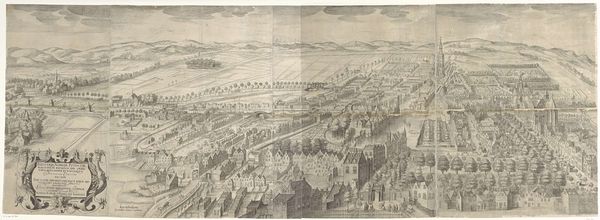
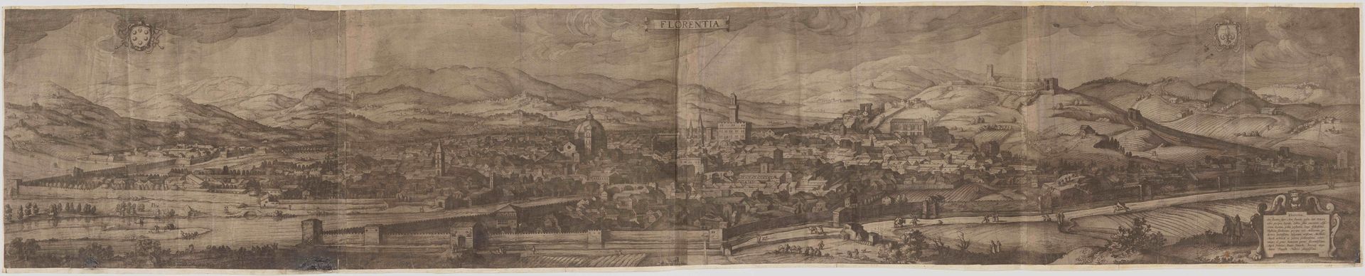
Editor: Here we have "Florence," an engraving and etching by Claes Janz. Visscher II from 1643. It's a sprawling cityscape, rendered with such fine detail. What draws my attention immediately is how the composition uses these dark, almost jagged lines to define the architecture against the softer, blurred background of the distant mountains. It’s quite striking. What compositional elements do you find most compelling? Curator: It is important to note the strategic distribution of light and shadow. Observe how Visscher manipulates tonal contrasts to articulate form. The artist is less concerned with an accurate record of reality; his goal is, perhaps, a balance between the representation and pure, formal design. Editor: You’re right; the interplay of light isn’t just descriptive; it seems almost performative. I’m wondering, looking at the repetition of shapes, how do you see that contributing to the overall feeling of the work? Curator: Repetition provides visual cohesion and rhythm. Notice how the towers echo one another in diminishing scale, drawing the eye deeper into the pictorial space. The strategic arrangement and proportion contributes to the structure and spatial understanding. Do you think Visscher successfully merges reality and constructed representation in this work? Editor: I do, now that I'm considering it more deeply. It makes the cityscape feel both monumental and intimate. Thank you, that really helped me look at the engraving in a new way, focusing on the intrinsic design. Curator: My pleasure. Close viewing truly allows us to perceive and appreciate the compositional organization inherent in Visscher’s "Florence."
Florence
1643


Artwork details
- Medium
- print, etching, engraving
- Dimensions
- 16 15/16 x 86 in. (43.02 x 218.44 cm) (plate)
- Location
- Minneapolis Institute of Art
- Copyright
- Public Domain
Tags
Comments

Conservation was generously funded by the Blackman-Helseth Foundation and Dena and Al Naylor. Claes Jansz. Visscher was one of the leading printmakers and publishers in Amsterdam in the 17th century. He capitalized on the growing market for topographical views and maps, republishing old plates and commissioning new ones. Visscher engraved this panoramic view of Florence himself, without setting foot in the city. It is an enlarged copy, nearly double the size, of a view published by Hieronymous Cock in 1557, of which one impression survives (National Library of Sweden, 36 x 130 cm). After Cock's death, the plate was acquired by the Dutch engraver Paul van der Houve, who republished the print in Paris in 1601(see impression in the Uffizi). Visscher's outsized view of Florence is rare, with just four other known impressions: Ashmolean (Oxford), British Museum (London), Kunshistorisches Institut (Florence), and Skoklester Castle (Sweden). The Sweden print is the only extant version to have the extended letterpress description of the print below the image. This is where Claes Jansz. Visscher is identified as the print's author, and the date of 1643 is given. Like many old oversized prints, Mia's impression is cut down and also missing the woodcut banner inscription above the image ["Florentia Pulcherrima, et Celeberrima, Splendidissimae et Florentissimae Thusciae Metropolis"].
About this artwork
Editor: Here we have "Florence," an engraving and etching by Claes Janz. Visscher II from 1643. It's a sprawling cityscape, rendered with such fine detail. What draws my attention immediately is how the composition uses these dark, almost jagged lines to define the architecture against the softer, blurred background of the distant mountains. It’s quite striking. What compositional elements do you find most compelling? Curator: It is important to note the strategic distribution of light and shadow. Observe how Visscher manipulates tonal contrasts to articulate form. The artist is less concerned with an accurate record of reality; his goal is, perhaps, a balance between the representation and pure, formal design. Editor: You’re right; the interplay of light isn’t just descriptive; it seems almost performative. I’m wondering, looking at the repetition of shapes, how do you see that contributing to the overall feeling of the work? Curator: Repetition provides visual cohesion and rhythm. Notice how the towers echo one another in diminishing scale, drawing the eye deeper into the pictorial space. The strategic arrangement and proportion contributes to the structure and spatial understanding. Do you think Visscher successfully merges reality and constructed representation in this work? Editor: I do, now that I'm considering it more deeply. It makes the cityscape feel both monumental and intimate. Thank you, that really helped me look at the engraving in a new way, focusing on the intrinsic design. Curator: My pleasure. Close viewing truly allows us to perceive and appreciate the compositional organization inherent in Visscher’s "Florence."
Comments
Conservation was generously funded by the Blackman-Helseth Foundation and Dena and Al Naylor. Claes Jansz. Visscher was one of the leading printmakers and publishers in Amsterdam in the 17th century. He capitalized on the growing market for topographical views and maps, republishing old plates and commissioning new ones. Visscher engraved this panoramic view of Florence himself, without setting foot in the city. It is an enlarged copy, nearly double the size, of a view published by Hieronymous Cock in 1557, of which one impression survives (National Library of Sweden, 36 x 130 cm). After Cock's death, the plate was acquired by the Dutch engraver Paul van der Houve, who republished the print in Paris in 1601(see impression in the Uffizi). Visscher's outsized view of Florence is rare, with just four other known impressions: Ashmolean (Oxford), British Museum (London), Kunshistorisches Institut (Florence), and Skoklester Castle (Sweden). The Sweden print is the only extant version to have the extended letterpress description of the print below the image. This is where Claes Jansz. Visscher is identified as the print's author, and the date of 1643 is given. Like many old oversized prints, Mia's impression is cut down and also missing the woodcut banner inscription above the image ["Florentia Pulcherrima, et Celeberrima, Splendidissimae et Florentissimae Thusciae Metropolis"].