print, engraving
#
allegory
#
narrative-art
#
baroque
# print
#
old engraving style
#
figuration
#
line
#
history-painting
#
engraving
Dimensions: height 491 mm, width 375 mm
Copyright: Rijks Museum: Open Domain
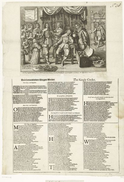
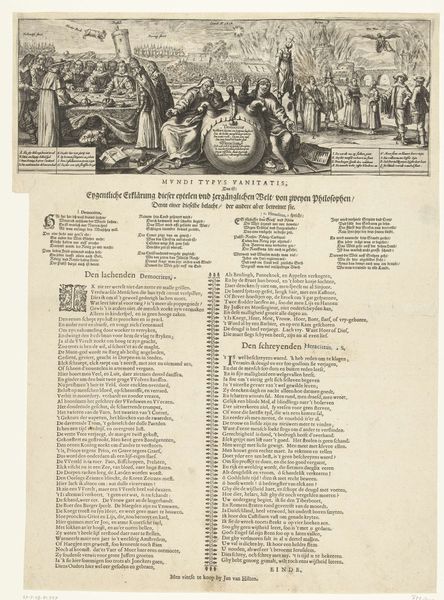
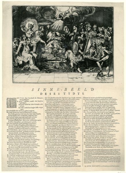
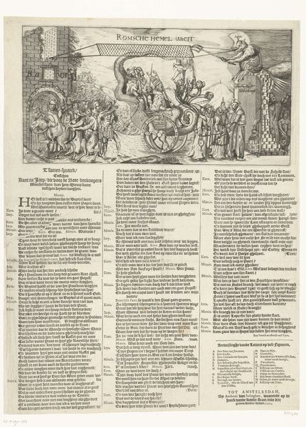
Curator: This print, titled "Allegorie op het einde van het Bestand, 1621", is an engraving from 1621. It’s rich in detail, as is typical for works of this era. Editor: Yes, the line work is really striking! The composition seems divided, almost like two distinct scenes, which makes it a bit confusing to read at first glance. What compositional strategies do you see at play here? Curator: Notice how the artist employs contrasting arrangements between the upper and lower registers? The upper portion features dynamic figuration, almost bursting with energy, whilst the text-heavy lower half is static, grounded. Do you observe any relationships between these stylistic differences and the print's overall meaning? Editor: It almost feels like a dichotomy between action and explanation. The image captures a moment, while the text below provides commentary or context. But I am not sure how? Curator: Indeed! Consider the use of line in each section. Above, it's dense, creating shadow and depth to convey drama. Below, it's uniform and regimented, almost clinical in its clarity. The density in the line work gives an insight in the difference of importance within the plate, could that be the message? Editor: That makes sense! So, the form itself, the way the engraving is structured, reinforces the message about, perhaps, conflict and resolution, or maybe chaos and order? The artist doesn't just tell us a story, they visually embody the ideas through the arrangement of the print itself. Curator: Precisely. It is by examining these intrinsic qualities – the contrasting styles, the arrangement of form – that we decipher the print's allegorical intent and meaning, a union between what it is said and how it is visually presented. Editor: It’s fascinating how the artist uses form to communicate so effectively! I hadn't considered how much the visual structure itself could contribute to the work's overall message. Thanks for pointing that out.
Comments
No comments
Be the first to comment and join the conversation on the ultimate creative platform.
More like this