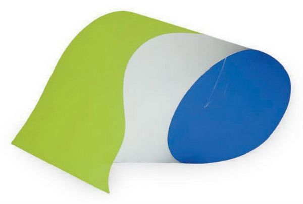
sculpture, resin
minimalism
postminimalism
colour-field-painting
geometric
sculpture
abstraction
resin
Copyright: Judy Chicago,Fair Use
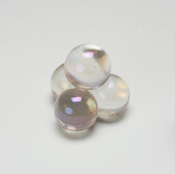
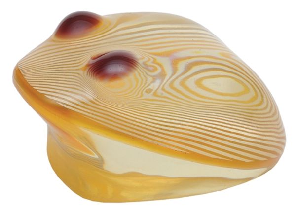
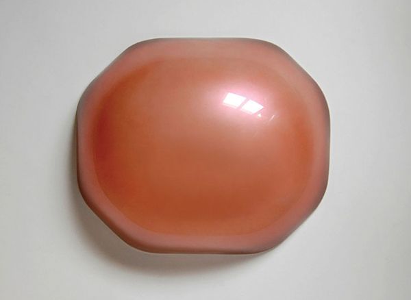
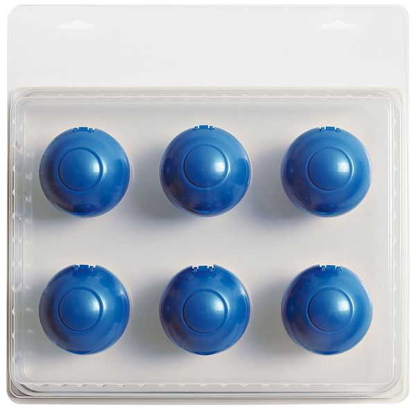
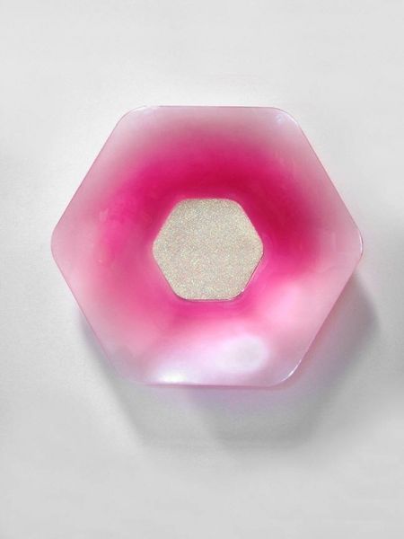
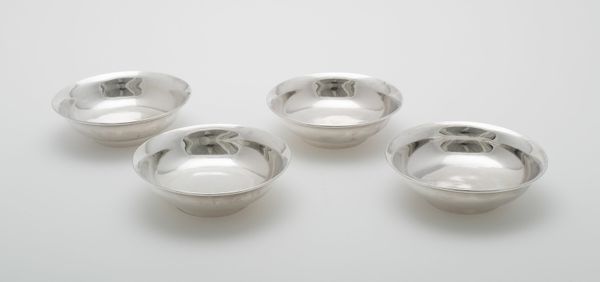
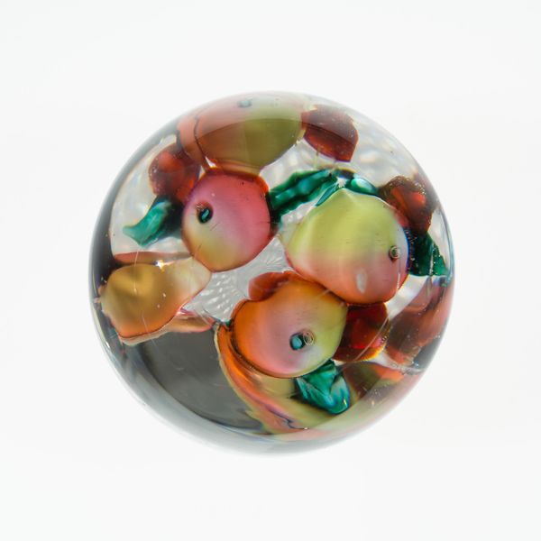
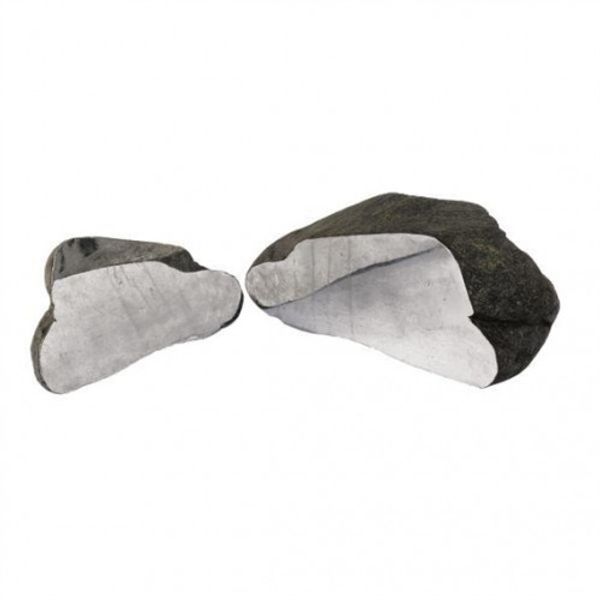
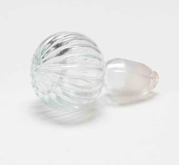
Editor: This is Judy Chicago's "Domes #1," created in 1968 using resin. They’re incredibly tactile! They remind me a bit of colorful candy drops. What stands out to you about this piece? Curator: Immediately, I'm struck by the formal tension between the simplicity of the dome shape and the complexity of the gradient color fields. The gradations of red, orange, yellow, and hints of green seem to push and pull at the geometric form. Notice how the perfectly smooth surfaces reflect light, emphasizing their materiality and volume. Editor: Yes, the surface is so smooth and shiny. They almost look liquid. Do you think the arrangement has any significance? Curator: The deliberate arrangement – a triangular grouping – enhances the piece's symmetrical quality and directs the viewer's eye. It suggests a relational interplay, perhaps even a narrative despite its abstract nature. Consider the individual domes; are they identical or do the subtle shifts in color and curvature generate unique identities within the ensemble? Editor: That's a good point. They seem identical at first glance, but now I notice that the distribution of color is different in each one, it’s a pretty neat use of color and shape. It plays with your perception. Curator: Precisely. The success of this piece lies in how Chicago uses reductive forms to create optical complexity. A balance between pure geometric abstraction and almost sensual chromatic interaction. We see Chicago engaging Minimalism and, potentially, proto-feminist ideas. It anticipates much of her later work while being, essentially, a study in form and color. Editor: That was incredibly insightful. I appreciate how you pointed out the relational and symmetrical nature of the artwork. Thank you for sharing your knowledge! Curator: My pleasure. This piece invites close looking, so don’t hesitate to keep observing to form your own interpretation.
Comments
No comments
Be the first to comment and join the conversation on the ultimate creative platform.
