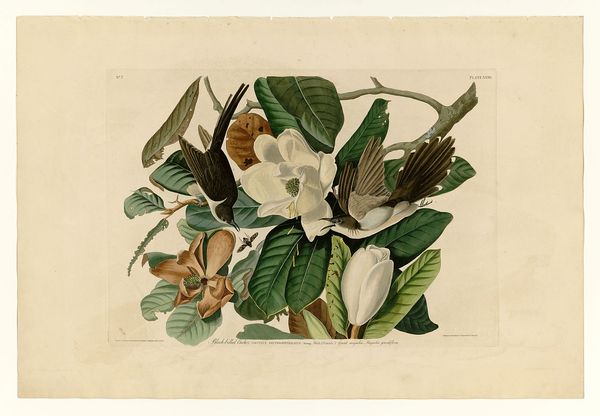
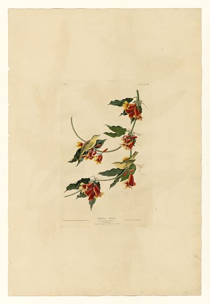
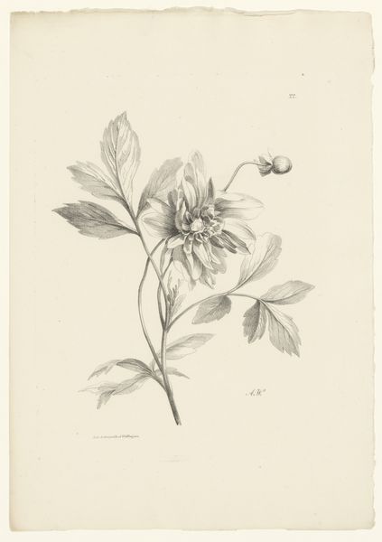
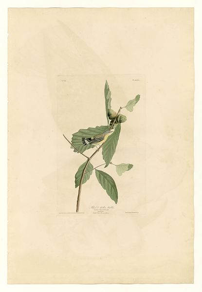
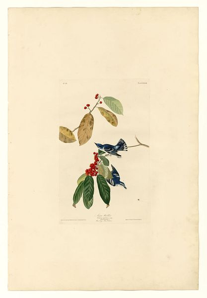
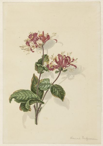
drawing, plein-air, watercolor
#
drawing
#
plein-air
#
landscape
#
watercolor
#
botanical drawing
#
line
#
watercolour illustration
#
naturalism
#
botanical art
Copyright: Public domain
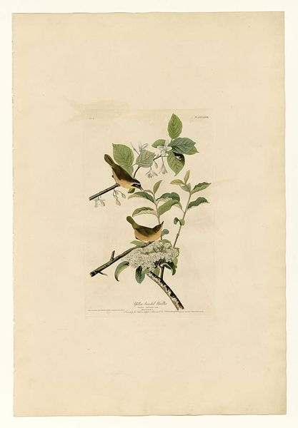
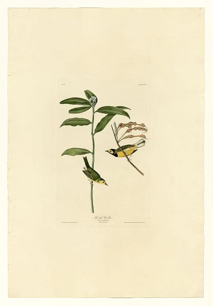
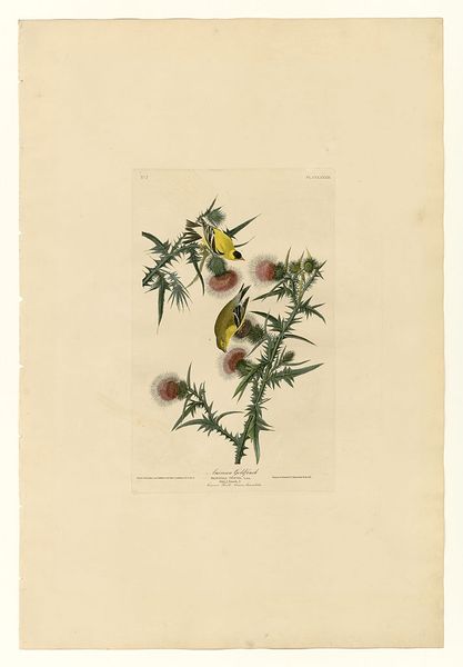
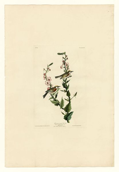
Editor: Here we have John James Audubon’s “Plate 20. Blue-winged Yellow Warbler,” a watercolor and drawing created in plein-air. I am struck by how delicate and precise the lines are. What stands out to you? Curator: Focusing solely on its visual aspects, notice the composition's equilibrium. The placement of the warblers and flowers creates a balanced yet dynamic interplay. Observe how the artist contrasts the sharp detail of the birds with the softer rendering of the foliage. This manipulation of texture and line serves to direct the eye and highlight the subjects. Editor: Yes, I see that. How do you feel about the use of space here? The composition seems to be fighting to remain within the picture plane. Curator: Indeed. The use of negative space contributes significantly. The stark background throws the subjects into sharp relief. It amplifies the intensity of their forms and colors. Do you see any significance in how the birds interact with their environment? Editor: I notice that the yellow in their wings is picked up by the flower centers... It creates a visual echo! I had not noticed that before. It is like a formal conversation between the birds and the plants. Curator: Precisely! It reinforces a sense of visual harmony. It also prompts deeper investigation into their relationship. Color is an inherent tool used to describe depth of field with the intention of cohesion of elements within the piece. Editor: Looking closer now, it seems that Audubon wanted me to really consider the texture, the detail and the geometry. Thank you. Curator: You are most welcome. Remember to study art as a unique set of interacting forms. Visual components have more value than simply cultural notions and references. The reward lies in close observation and considered application of theory.
Comments
No comments
Be the first to comment and join the conversation on the ultimate creative platform.
More like this