Copyright: Isidore Isou,Fair Use
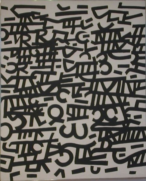
Isidore Isou made Hypergraphie/Pour Virginie Nr. 9 with a kind of playful precision. The vertical stripes of red, yellow, orange, and green are a backdrop for these curious glyph-like shapes. It’s like Isou took a handful of symbols and let them arrange themselves on the page. The main form is a black outline, filled in with what looks like tiny fragments of text and color. There’s something almost archaeological about it, like digging up ancient artifacts. The texture is flat but has a certain depth, because you know the black lines are sitting over the layers of text. I keep coming back to the circle on the left. The horizontal lines cutting across it, like the bars of a cage. Isou, along with the Lettrists, were pushing against conventional forms, and you can see how he’s stretching and pulling at language, trying to make it do something new. He reminds me a little of Cy Twombly, also looking for new ways of writing and making meaning through marks. Ultimately, there’s no single meaning; it’s more like an invitation to imagine.
Comments
No comments
Be the first to comment and join the conversation on the ultimate creative platform.
More like this