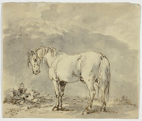
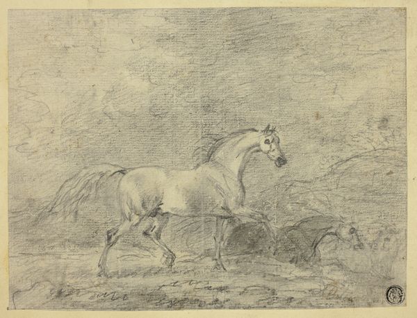
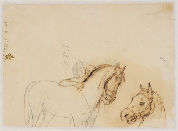
drawing, print, paper, graphite
#
drawing
# print
#
landscape
#
figuration
#
paper
#
graphite
Dimensions: 202 × 273 mm (sheet); 331 × 434 mm (secondary support)
Copyright: Public Domain
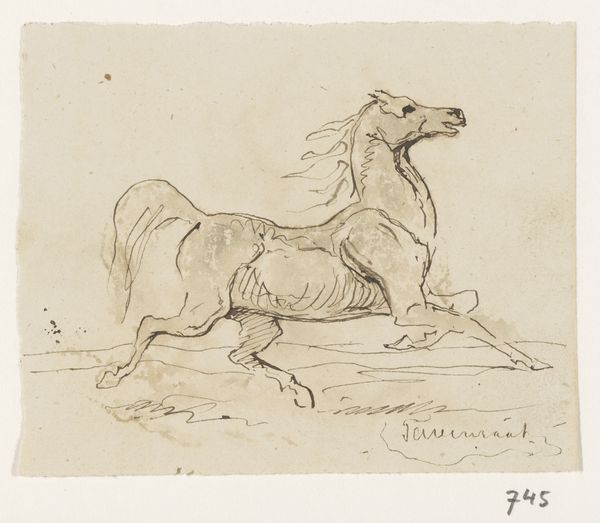
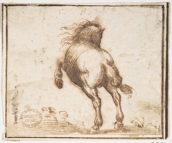
Editor: So, here we have "Riderless Horse," an undated drawing by Charles Parrocel, rendered in graphite and other media on paper. The way the horse is positioned, with its back to us, makes it feel like it's abruptly running away. What compositional choices stand out to you in this piece? Curator: Immediately striking is the dynamic contrast achieved through line quality. Note the confident, assured strokes defining the horse’s form – observe the muscular tension, the detailed rendering of the mane. These strong lines contrast sharply with the sparse, almost skeletal, suggestion of the landscape. What effect does this dichotomy create, do you think? Editor: It isolates the horse, making it the clear subject, drawing your eye to it against an otherwise blank background. So it is less about the context but about the horse itself? Curator: Precisely. Parrocel reduces the surrounding environment to mere suggestion, directing our attention to the animal's powerful physique and implied movement. The horse's rump is really the center of this piece; see how its shape and detail are defined and emphasized with these structural qualities? The composition’s strength comes from how he emphasizes shape and the movement it gives off. Editor: It's almost sculptural in its presentation despite being a drawing. The formal choices seem to suggest that a sense of immediacy was important. Curator: Consider how the riderless aspect factors into our analysis. The absent rider heightens the sense of untamed energy, emphasizing the animal's inherent power and autonomy. Also, do you notice any contrast with other shapes within the artwork? Editor: You mean besides the landscape? Well, yes. The horse, rounder shapes mostly, fills the majority of the composition; in contrast the landscape uses long thin lines... almost jagged-like in certain sections of the page. Curator: The angular versus rounded contributes further to the effect of starkness and movement. So while the title directs us to acknowledge an absence, the formal elements draw our attention to a distinct, physical presence and direction of motion. Editor: That focus on physical presence is interesting and wasn't my initial focus, which helps show how much one can find when you study form!
Comments
No comments
Be the first to comment and join the conversation on the ultimate creative platform.
More like this