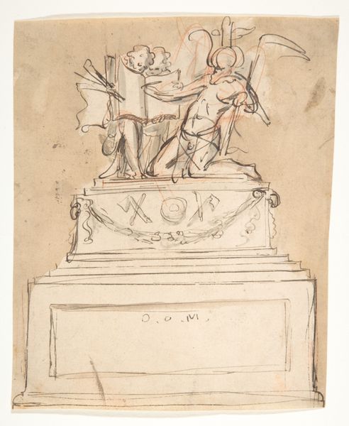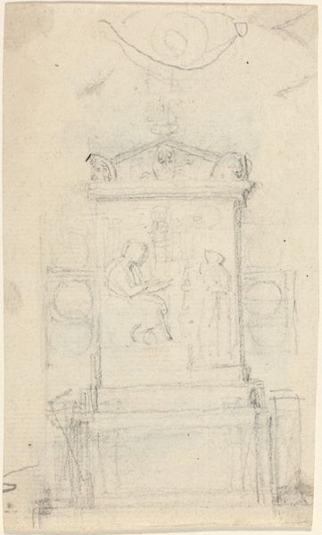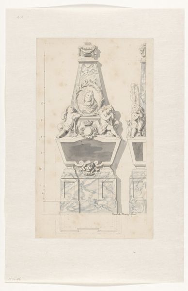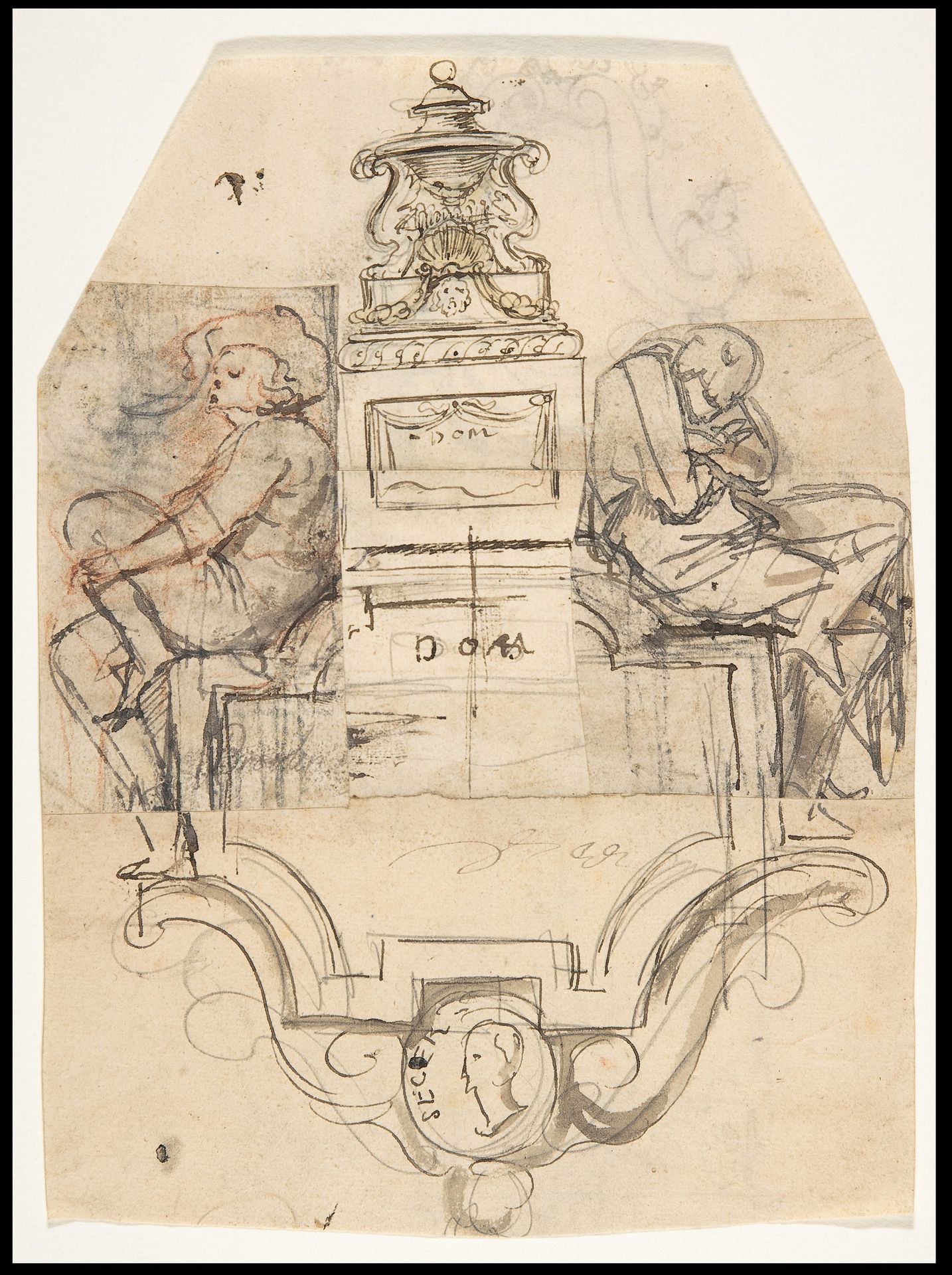
1686 - 1724
Design for a sepulchral monument; verso: Design for a monument
Pieter Verbruggen the Younger
1648 - 1691The Metropolitan Museum of Art
Metropolitan Museum of Art, New York, NYListen to curator's interpretation
Curatorial notes
Editor: Here we have Pieter Verbruggen the Younger's "Design for a sepulchral monument; verso: Design for a monument," dating roughly between 1686 and 1724. It's an ink drawing on toned paper. The piece feels very preliminary, with sketch-like qualities, but also somber given the subject matter. How do you approach a work like this from a formal perspective? Curator: Focusing solely on the visual components, the balanced composition immediately strikes me. We have a symmetrical arrangement, figures mirrored on either side of what seems to be an elaborate tomb design. Note the use of line, predominantly contour drawing. The artist uses hatching to define form, yet the figures remain somewhat flat, lacking a full sense of three-dimensionality. Editor: So, the balance and lines are crucial to understanding the image. Is the symmetry purely aesthetic, or does it suggest anything deeper about the monument's intended message? Curator: The symmetry, in a formalist reading, could signify order and control – perhaps a desire to contain grief through structured artistic expression. Look, also, at the variations in line weight. Where does the artist emphasize certain contours, and why? What is the effect? Editor: The darker lines definitely draw my eye to the central monument and the faces of the figures. Is there any specific semiotic framework at play here, particularly with elements such as the figures' posture or the objects adorning the tomb itself? Curator: Precisely! Those elements can be interpreted as signs. The downcast heads of the figures, rendered with heavier ink, can be read as signs of mourning. But the formality of their poses, along with the classically inspired urn, complicates a purely emotional reading. There's a deliberate distancing effect. Ultimately, the interplay between the sketched forms and the architectural rigidity shapes our understanding of the work. Editor: That’s fascinating. Thinking about the relationship between the form and its potential function really opens up the drawing. Thanks for helping me analyze its composition more closely! Curator: Indeed. A deeper exploration into its visual rhetoric unveils a richer understanding.