drawing, paper, pen
#
drawing
#
script typography
#
hand-lettering
#
old engraving style
#
hand drawn type
#
hand lettering
#
paper
#
personal sketchbook
#
hand-drawn typeface
#
pen work
#
pen
#
handwritten font
#
calligraphy
#
small lettering
Copyright: Rijks Museum: Open Domain
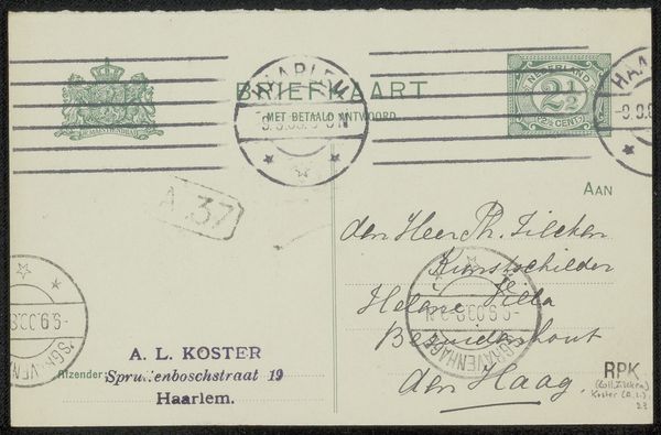
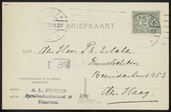
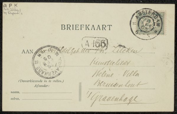
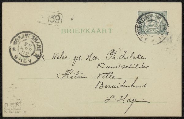
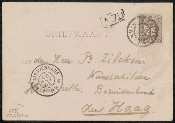
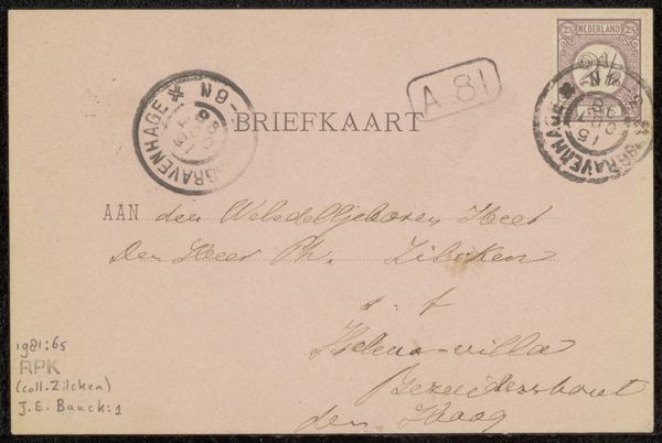
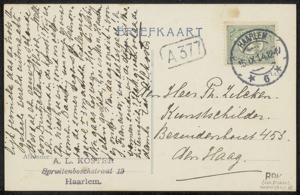
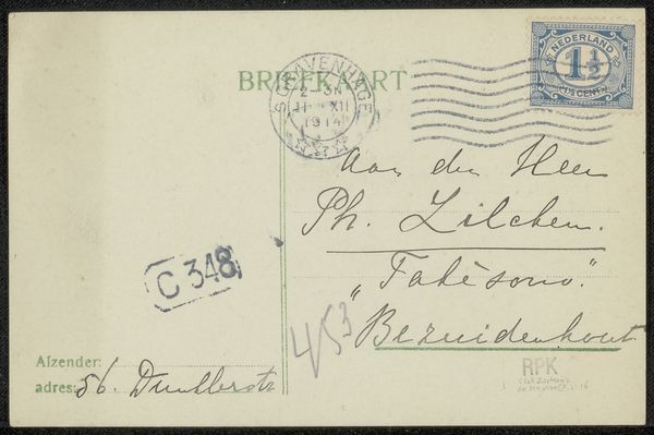
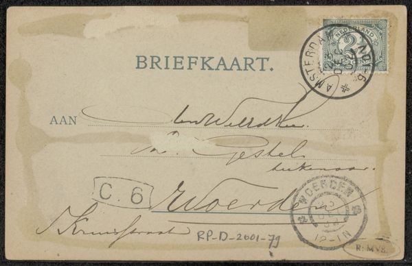
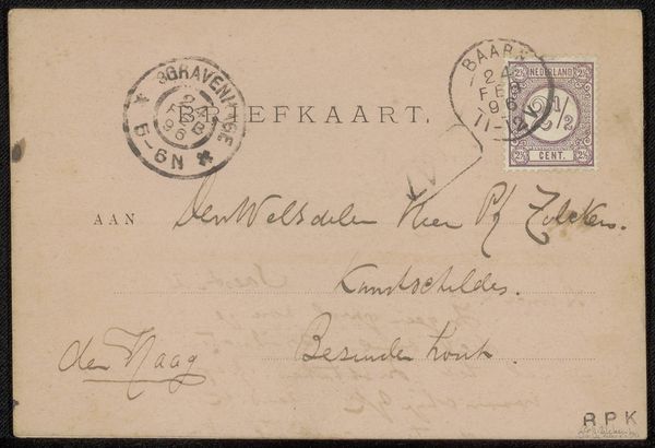
Curator: This work is entitled "Briefkaart aan Philip Zilcken," a postcard created by Anton L. Koster likely before 1916. It is rendered in pen and ink on paper. What are your initial thoughts? Editor: Well, the delicate script immediately grabs my attention. The composition seems functional, dictated by the conventions of postal communication, yet the artistry in the lettering elevates it. It feels quite personal, a snippet of daily life from another era. Curator: Precisely. Note the careful application of ink; Koster varies line weight to create emphasis and visual hierarchy. The circular stamp, the frankness of "Briefkaart," all speak to a clear typographic intention beyond pure utility. It engages with the established language of officialdom and graphic messaging, pushing that into expressive lettering, thus enhancing the address details. Editor: It is intriguing how he merges functionality with what we might consider art. The materiality, just paper and ink, speaks volumes about accessibility, how artistic expression wasn't confined to elaborate studios or expensive canvases. A humble, ubiquitous medium. One has to consider, was the post itself perhaps a type of distributed gallery or ephemeral museum, touching base across cities with art? Curator: Interesting thought! Moreover, the hand-lettered elements introduce an element of imperfection, human touch absent in mechanical printing. Each stroke reveals Koster's hand and presence in constructing and delivering the correspondence, something lost when postcards are stamped by machines instead of art. Editor: Absolutely, and you sense a deliberate approach. How was it made? Was it drawn quickly on location or carefully rendered indoors with a calligraphic nib? It suggests an attitude to the process of correspondence as craft rather than pure transaction, adding value to the physical process of sending. The value is that art becomes part of social exchange, not some untouchable object behind glass. Curator: That perfectly highlights the tension between form and function at play. This "Briefkaart" becomes an eloquent testament of graphic communication itself. Editor: I leave with renewed respect for the art inherent in everyday practices. It goes to show you that the real beauty often exists in how material conditions support accessible creativity and social connection.
Comments
No comments
Be the first to comment and join the conversation on the ultimate creative platform.
More like this