Copyright: Modern Artists: Artvee
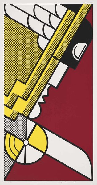
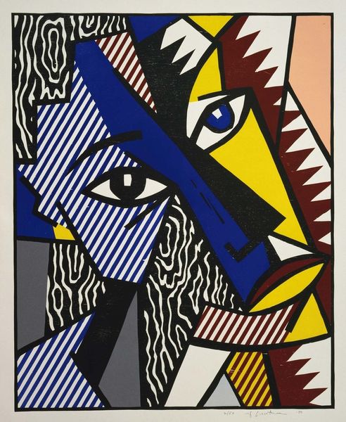
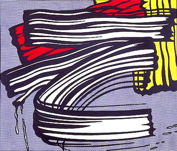
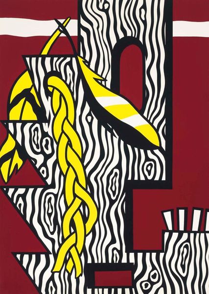
Roy Lichtenstein made this print, "I Love Liberty", and you can really see how he’s pushing and pulling at the surface, turning this icon into something so flat, so graphic. Look at the way he’s used those bold, solid colours – black, yellow, and white – alongside those lines, it’s like he’s making the familiar feel totally new. Lichtenstein wasn't trying to hide the way the image was made. Each mark is part of a process, and that's how you experience the artwork. I keep thinking about that stark contrast, how the simplicity forces us to confront our own ideas about freedom. This piece reminds me a bit of Warhol’s prints, where repetition and bold imagery challenge our notions of value and meaning. And really, isn't that what art's all about, questioning what we think we know?
Comments
No comments
Be the first to comment and join the conversation on the ultimate creative platform.
More like this