print, typography, engraving
#
baroque
# print
#
typography
#
engraving
Dimensions: height 350 mm, width 450 mm
Copyright: Rijks Museum: Open Domain
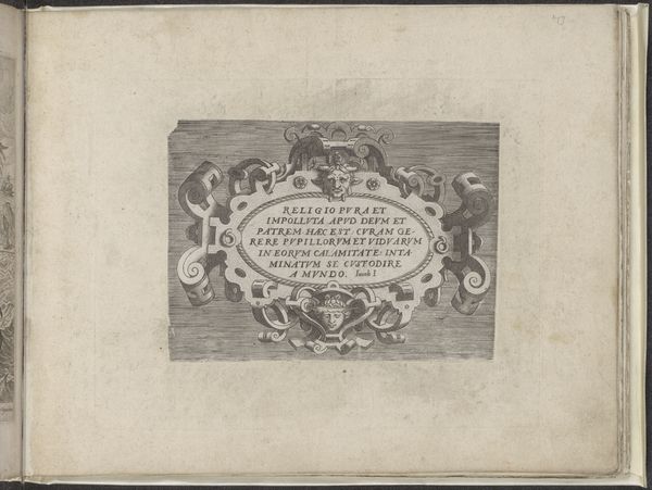
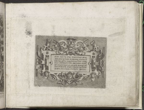
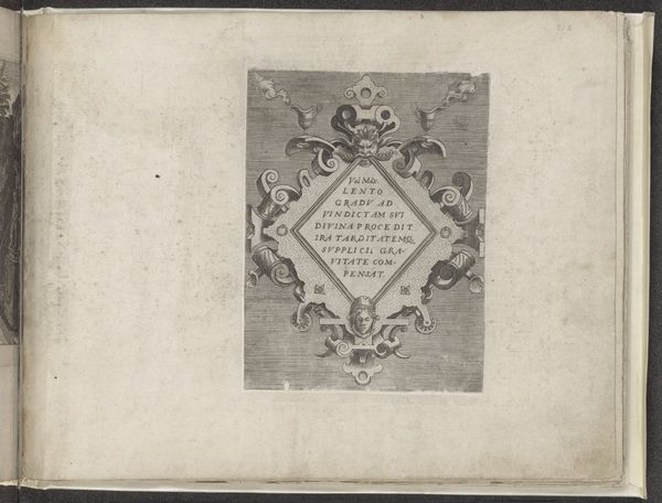
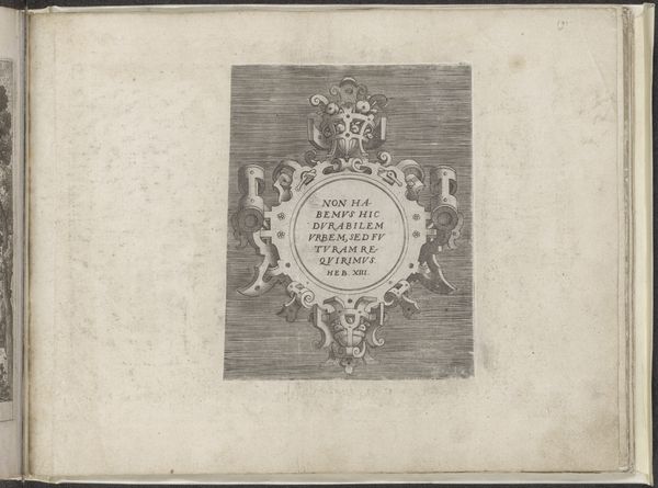
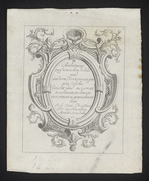
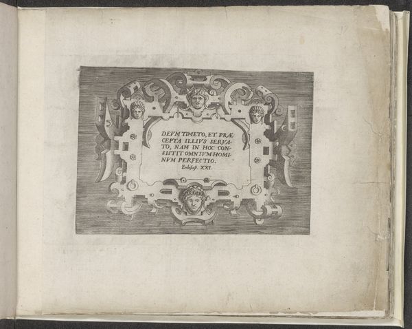
Curator: This print, titled "Titelprent voor de serie ontwerpen voor meubels," or Title Page for a series of furniture designs, was created in 1698 by Filippo Passarini. It’s an engraving showcasing Baroque style, intended as a frontispiece for a collection of furniture design blueprints. Editor: The intricacy is astonishing. I'm struck by this incredibly detailed frame, which almost swallows the title. It gives it a rather intense, almost overwhelming feel. I can only imagine how the rest of the series looked! Curator: Baroque art, especially in design like this, often sought to impress with its grandeur. This title page serves to establish the artistic sensibility for the entire series, setting expectations for lavish and ornate furniture designs to come. The typography itself becomes part of the visual display. Think of the context – luxury and opulence was almost a demand. Editor: And yet, despite all that Baroque flair, I almost want to strip away some of those decorations! I mean, can you imagine a modern take on this where only the typography remains? I suspect it would look brilliant printed as a graphic artwork in today's era. Curator: Stripping away that ornament is a valid contemporary response. Though, remember, ornament played a key role in differentiating elite production in the 17th century, and the rise of a consumer society across Europe and the colonial world, where the elite sought objects reflecting its worldview. Ornament legitimated social class. Editor: I get that, but it also makes me question accessibility. Does this level of ornate detail risk alienating potential users and making it seem…distant? Even oppressive in its luxury? I can't decide whether it should inspire, intimidate, or make the furniture user smile in a whimsical moment. It strikes me that one intention, back then, may have involved communicating messages about hierarchies that feel quite strange today. Curator: It is a tension inherent to much of Baroque art, which functioned as an explicit display of power and control. It's powerful to be mindful of what we might interpret and grapple with today as compared to audiences for this work at the time. Editor: Indeed. On reflection, it makes me see the Baroque a little differently, beyond the frills. Curator: A fascinating complexity to ponder indeed!
Comments
No comments
Be the first to comment and join the conversation on the ultimate creative platform.
More like this