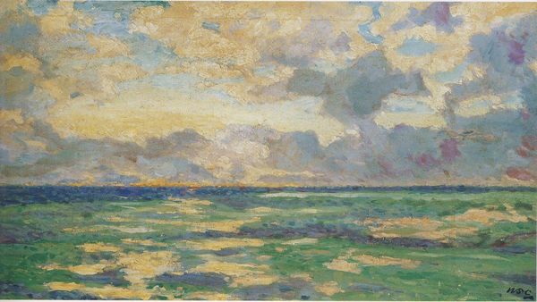
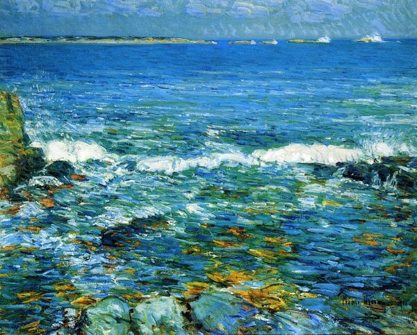
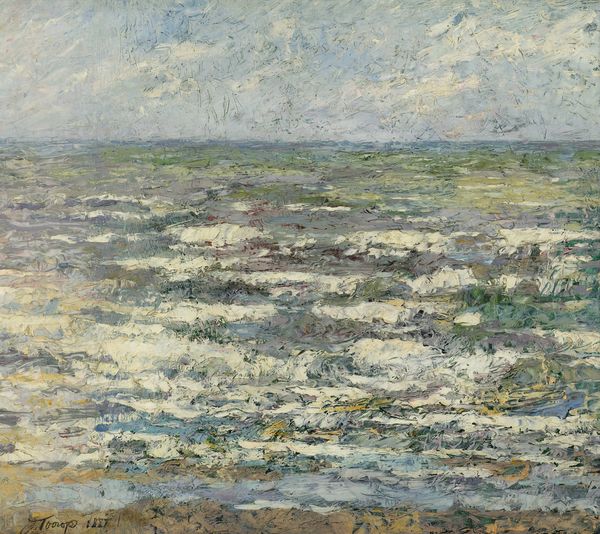
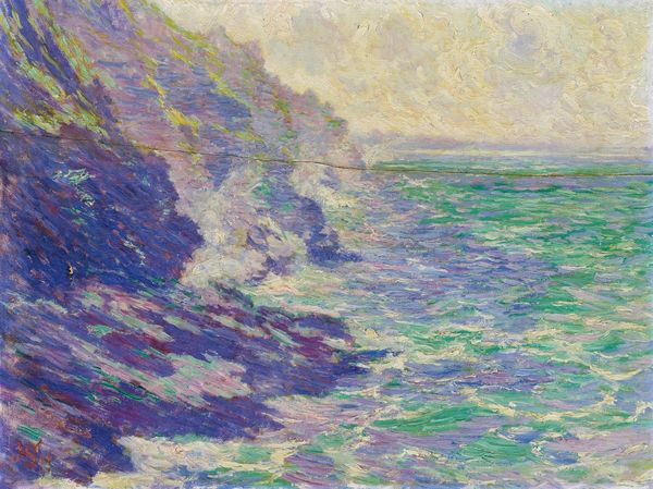
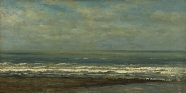
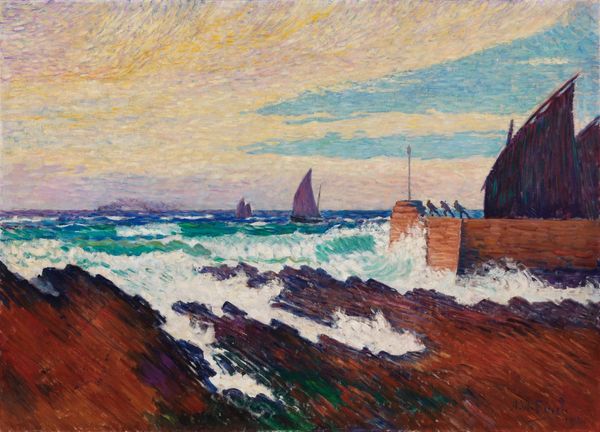
painting, plein-air, oil-paint
#
painting
#
impressionism
#
plein-air
#
oil-paint
#
landscape
#
impressionist landscape
#
oil painting
#
water
#
sea
Copyright: Public domain
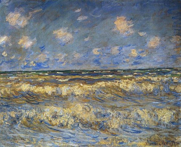
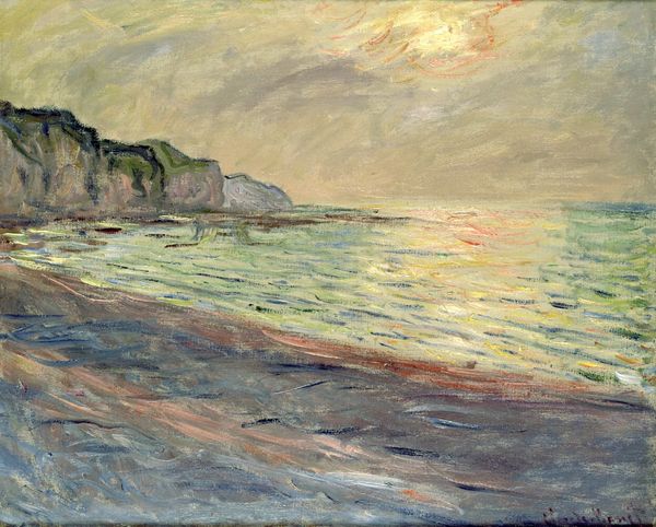
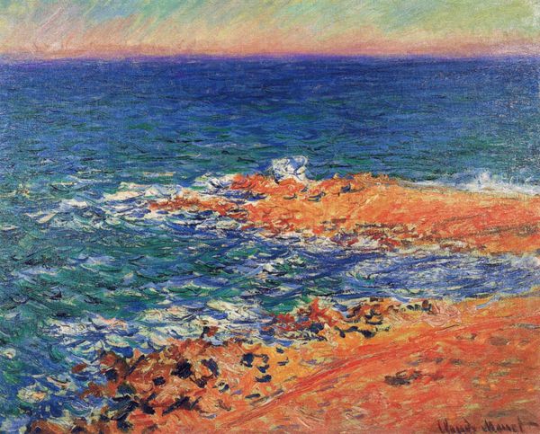
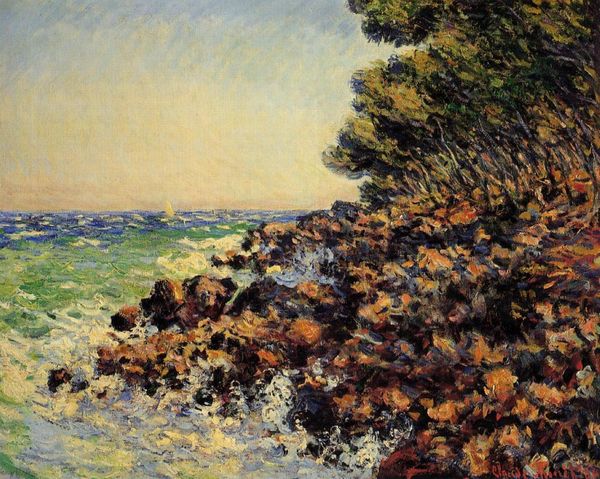
Editor: So here we have Monet's *The Seacoast of Pourville, Low Tide*, painted in 1882 using oil paint. I'm struck by how the movement of the water is conveyed, almost like shimmering light, with such textured brushstrokes. What do you make of the composition, focusing on its intrinsic formal qualities? Curator: Note the subtle interplay between the horizontal expanse of the sea and the assertive diagonal of the receding tide. Consider how the composition teeters between symmetrical and asymmetrical; there is a certain implied balance disrupted only by minor inflections of colour, and those barely-there ships in the distance. Editor: Yes, I see what you mean! The asymmetry, or that implied disruption you mentioned, keeps it dynamic. It isn't just a flat depiction. How does Monet use colour here to enhance the structural elements? Curator: Examine how the muted palette functions. Predominantly, it is an array of greens, blues and browns. The variations are not dramatic; and so this enforces an internal unity to the landscape itself. It emphasizes a subtle chromatic coherence – can you discern the visual strategies which tie everything together into a single representational whole? Editor: I can see how those recurring muted tones help unify the sea, sand, and sky, despite their differences in texture. There's a quiet harmony. It’s almost meditative. I never really appreciated how crucial color is, even in something so seemingly spontaneous. Curator: Precisely. And that "spontaneity" as you called it is in effect the result of highly systematic formal organization, albeit one masquerading behind "naturalism." Editor: I guess there is much more intentionality than I thought. I'll never look at Impressionism the same way. Thanks.
Comments
No comments
Be the first to comment and join the conversation on the ultimate creative platform.
More like this