Copyright: Public Domain: Artvee
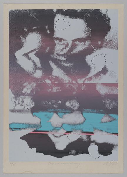
Lanny Sommese made this print sometime around 1979 or 80, and it looks like he was advertising some health administration institutes. The cool thing is the way he's used a screen printing technique with a duotone effect, where the pink and blue overlap to make this kind of halftone pattern. You can really see the individual dots up close. I love that you can see the process, you know? It's not trying to hide anything. The image itself is just, like, two hands – a big pink one and a smaller blue one nestled inside. There's something protective about it, maybe even a little bit vulnerable. The pink is loud, almost aggressive, but then the blue is soft and receding. They’re both incomplete. This tension between the hands is what draws you in. Sommese is known for his graphic design, and his work really reminds me of some of the poster artists from the WPA era, using simple, bold imagery to communicate a message. And like the best art, the message here is open to interpretation, not fixed or defined.
Comments
No comments
Be the first to comment and join the conversation on the ultimate creative platform.
