Curatorial notes
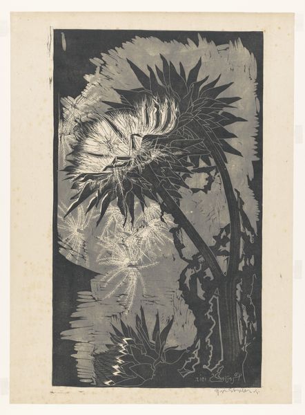
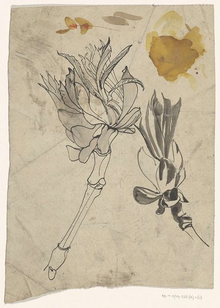
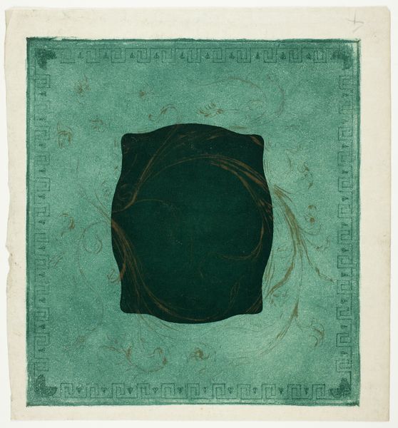
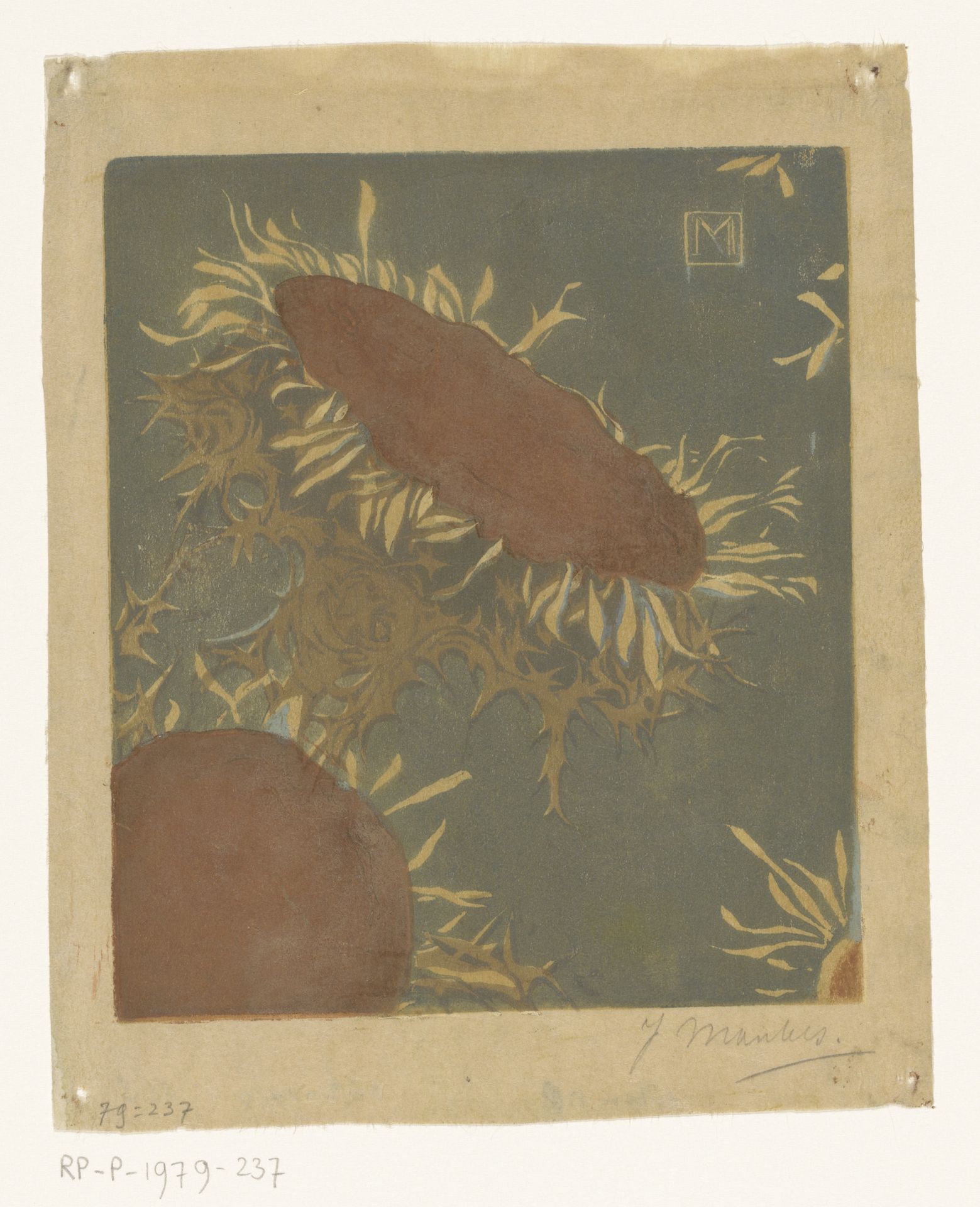
Editor: Here we have Jan Mankes’s “Twee distelbloemen,” or “Two Thistle Flowers,” a watercolor from 1914. The colour palette gives the piece a subdued and almost eerie quality. The subjects float against this strange olive backdrop... What can you tell me about the artist's approach? Curator: It is fascinating how Mankes utilizes the properties inherent in the watercolor medium. Note how he creates a unique layering of forms. Do you notice how the artist emphasizes the outlines, creating an intricate structure and flattened plane, drawing our attention to the two thistle flowers? Editor: I do, and that's partly why I called them eerie. There is almost a sense of volume implied with these layered, yet flattened forms. Curator: Yes, there is this very tension you’re highlighting – a juxtaposition of dimensionality and flatness that guides the eye throughout. The darker forms add a sense of grounding against a soft gray backdrop. Notice also Mankes' use of texture. Editor: Definitely. The details around the central form show an appreciation for material composition, while their symbolic implications remain veiled, don't you think? Curator: Not necessarily veiled. A close inspection reveals meticulous application with restraint in tonal values, creating rhythmic complexity. Consider how this aligns with the artist’s intent to refine visual sensations into a delicate exploration of intrinsic structures. Editor: Okay, so a meticulous composition intended to make us see plants in a totally different way. Curator: Precisely! By reducing nature into essential forms, the artwork celebrates its inherent artistic essence while minimizing any direct symbolism, letting the artwork become the main signifier. Editor: Well, I will definitely keep my eye out for those intrinsic visual sensations when looking at art going forward. Thanks for clarifying that perspective!