Copyright: Pedro Calapez,Fair Use
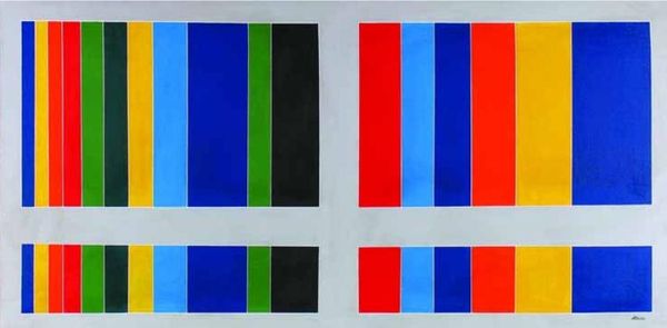
Editor: We're looking at "Escala de cor #17," a 2008 acrylic on canvas piece by Pedro Calapez. It's composed of five horizontal rows of alternating red and blue squares. It reminds me of a deconstructed flag. How do you interpret this work from a formalist perspective? Curator: What immediately strikes me is the chromatic intensity. Note how the artist modulates the saturation of each square. How does this fluctuation between near-identical colour fields affect your perception? Editor: I see what you mean! Some blues are deeper, more matte, than others, which appear brighter, more reflective. And it is similar with the reds... I suppose it keeps the eye moving, disrupting the grid. Curator: Precisely. The subtle imperfections in the application, those visible brushstrokes, are essential too. It disrupts the sterile perfection one might associate with geometric abstraction, introducing a haptic quality, don't you agree? Editor: Yes, I see it now! The painting isn't just about color; it’s about the texture and the process of applying the paint itself. That makes it more… human. What a lovely contradiction. Curator: Indeed. We see a structured system undermined by the materiality of its execution. It becomes a meditation on the nature of order and its inevitable entanglement with imperfection. It asks, can pure geometric forms ever truly exist outside of artistic conceptualization? Editor: That's fascinating. I initially saw it as a simple pattern, but focusing on the materiality gives it such depth. I never realized the degree to which surface application could affect our perception of a work! Curator: Art invites questions about seeing and perceiving, and as we see today, its ability to spark dialogue makes it transformative.
Comments
No comments
Be the first to comment and join the conversation on the ultimate creative platform.
More like this