Dimensions: image: 57.2 x 40 cm (22 1/2 x 15 3/4 in.) sheet: 65.4 x 47.6 cm (25 3/4 x 18 3/4 in.)
Copyright: National Gallery of Art: CC0 1.0
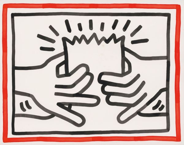
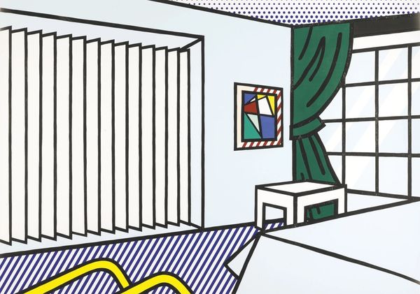
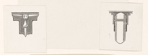
Editor: This is Roy Lichtenstein's "Knock, Knock Poster" from 1975. It’s a print, all in black and white, depicting exactly what the title says. I'm struck by its bold simplicity – a very direct composition. What aspects of its form particularly stand out to you? Curator: Note the careful orchestration of lines. Observe how Lichtenstein articulates depth and dimension through variation in line thickness. The emphatic black lines create an undeniable two-dimensionality, flattening the representational door and word-balloons. Editor: I see that now. The limited contrast flattens the image, which, combined with the "Knock, Knock," creates almost a graphic shout. Do you think this contributes to the pop-art aesthetic? Curator: Precisely! Examine also how Lichtenstein employs repetitive visual cues. The duplication of the phrase "Knock, Knock," alongside radiating lines around the words creates a pattern. The interplay between word and image. Does it create meaning beyond simple representation? Editor: I suppose the repetition emphasizes the sound, making it almost physically palpable despite being a still image. Like the insistent pounding is somehow breaking the plane of the artwork! What do you find most fascinating about this interplay between typography and imagery? Curator: It is fascinating to behold. To see that what may appear so basic relies so expertly on manipulating forms. The clean lines juxtapose the playful subject to form something simple, bold, and unforgettable. Editor: I now see it as a deceptively simple design. It relies more on visual structures and forms to engage than I first assumed. Thanks!
Comments
No comments
Be the first to comment and join the conversation on the ultimate creative platform.
More like this