drawing, paper, pencil, graphite, pastel
#
portrait
#
drawing
#
hand-lettering
#
hand drawn type
#
hand lettering
#
paper
#
hand-drawn typeface
#
pencil
#
graphite
#
sketchbook drawing
#
pastel
#
academic-art
Copyright: Rijks Museum: Open Domain
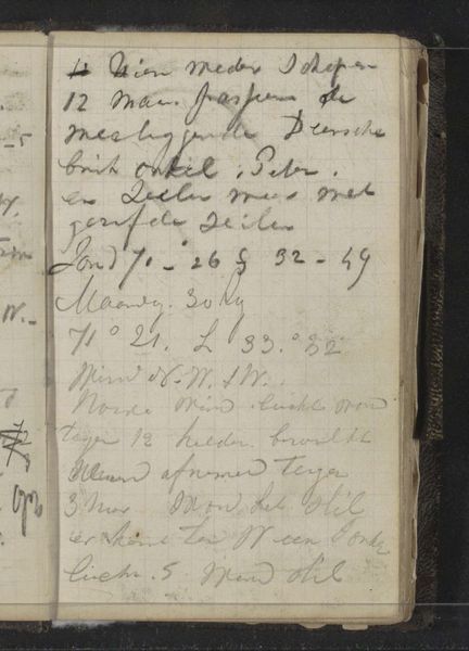
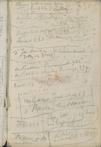
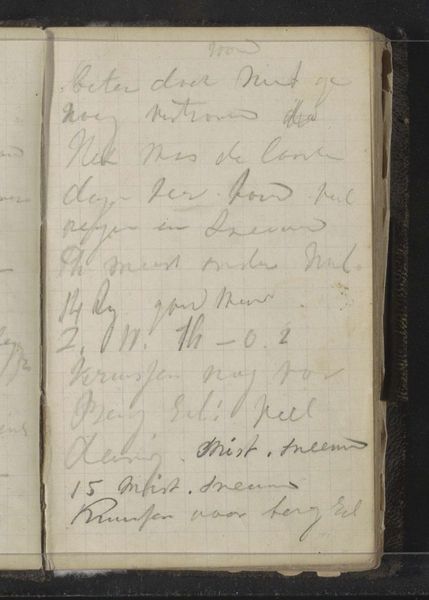
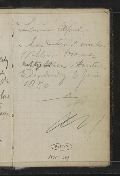
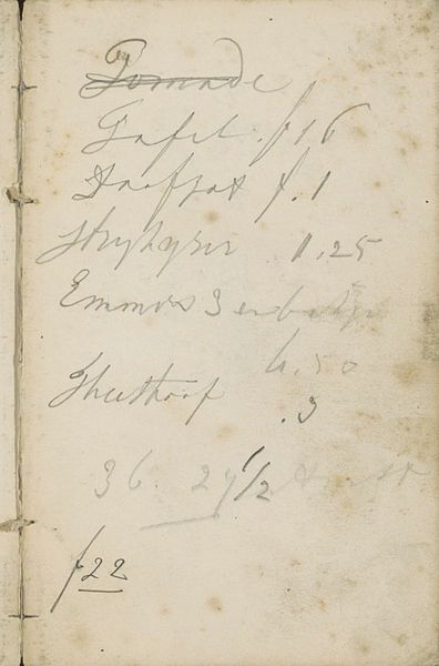
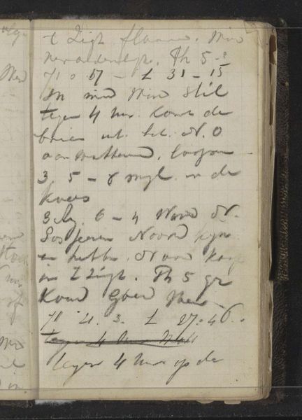
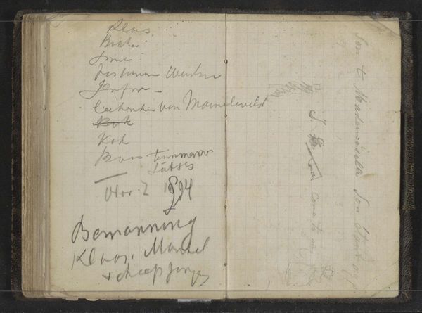
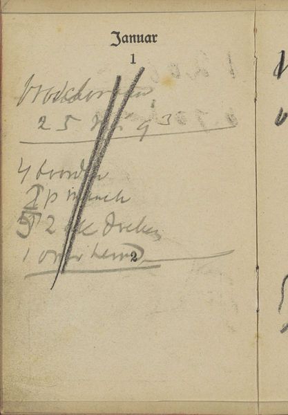
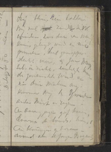
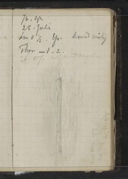
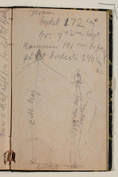
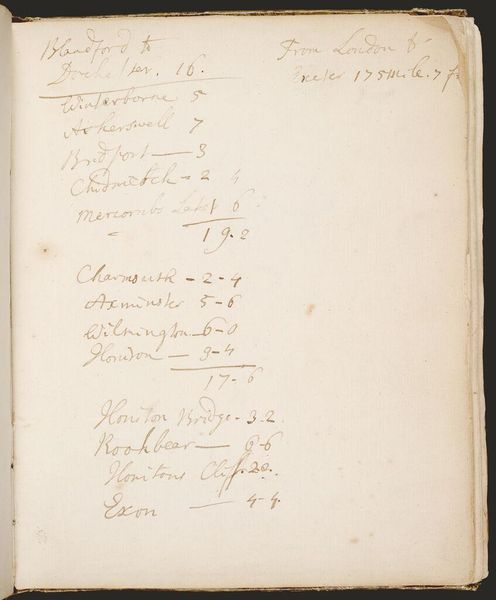
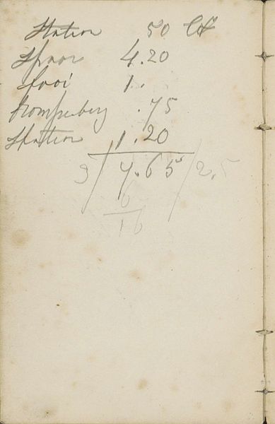
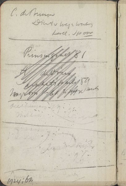
Curator: Here at the Rijksmuseum, we have "Annotaties" by Louis Apol, a drawing created around 1880. It appears to be graphite and pastel on paper, and its… well, its appearance is rather unassuming at first glance. What do you make of it? Editor: It looks like someone's handwritten notes, faded and overlapped on the page. It has a quality of ephemerality; it makes me feel as if I have found a page in an old book tucked away somewhere. But is there something beyond this surface that might suggest significance to the artist, Apol? Curator: Given that Apol was known for his landscape painting, this little study could easily be overlooked. But for an artist primarily capturing scenes, words and letterforms must have been important too. Editor: Precisely. Lettering, and handwriting in particular, carries so much coded cultural and personal weight. These names, dates… even scribbles. Are these shorthand for places? For feelings? I want to interpret some hidden memory here. The loops and elegant signatures give the air of Romanticism, and their presence hints toward ideas that may have lived more robustly in the consciousness of the time. Curator: Absolutely. Looking closer, it appears as though this is some sort of list. You can decipher years like 1848 and 1903 among the various entries, with signatures overlaid by large loops that might have been someone acknowledging their visit at different locations across a given landscape during a period. Editor: That thought transforms the document for me. Like a secret code revealing a set of waypoints for the culturally aware! This resonates with older, deeper functions for written languages as having both practical uses, and spiritual connections for certain words which even had supposed divine origins at certain moments throughout time. Curator: The use of graphite and pastels softens the whole impression too, as though deliberately to not over-emphasize the value of any single inscription, giving greater overall prominence to the document itself. Editor: The translucence, in my opinion, works wonders. You begin to think, what kind of conversation may happen here? You’re essentially getting a cultural record across time that might connect various dots for any reader willing to analyze deeply. Curator: Fascinating! In short, a delicate glimpse into how letterforms preserve memories, both personally and collectively. Editor: I couldn't agree more. What a fantastic way to end this conversation on something beautiful!
Comments
No comments
Be the first to comment and join the conversation on the ultimate creative platform.
More like this