#
character portrait
#
head
#
face
#
caricature
#
portrait reference
#
animal drawing portrait
#
nose
#
portrait drawing
#
facial portrait
#
forehead
#
portrait art
#
fine art portrait
#
celebrity portrait
#
digital portrait
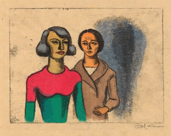
Copyright: John Brack,Fair Use
John Brack's painting, Two Typists, gives us these figures rendered in a way that feels, well, typed. The palette is reserved, almost bureaucratic in its muted tones, and the mark-making feels intentional, like each stroke is a calculated keystroke. There’s a tension here, a stillness that almost hums with unspoken energy. The paint application is smooth, and the colours are laid out like the keys of a typewriter, each in their rightful place. Look at the way Brack articulates the faces – those sharp, almost architectural noses! It’s like he's building a structure, a psychological space on the canvas. And those little pearl earrings, each one a tiny rebellion against the rigidity of the whole. Brack reminds me a bit of Philip Guston, but without the angst and the goo. There's something about that deliberate awkwardness that makes you question the nature of representation itself. Is this realism? Is it satire? Is it just a way of seeing? I think Brack wants us to consider all three.
Comments
No comments
Be the first to comment and join the conversation on the ultimate creative platform.
More like this